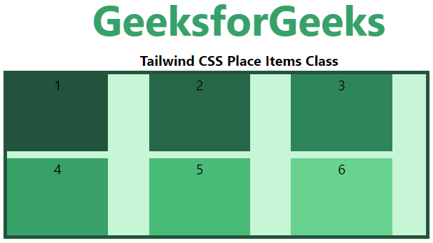
Class này chấp nhận nhiều giá trị trong tailwind CSS. Nó là một lựa chọn thay thế cho CSS Place Items property. Class này dùng để kiểm soát cách một phần tử được căn chỉnh. Đồng thời nó cũng giúp phần tử được căn giữa. Bạn có thể đặt nhiều giá trị class trong một class duy nhất.
Place Self Classes:
- place-self-auto
- place-self-start
- place-self-end
- place-self-center
- place-self-stretch
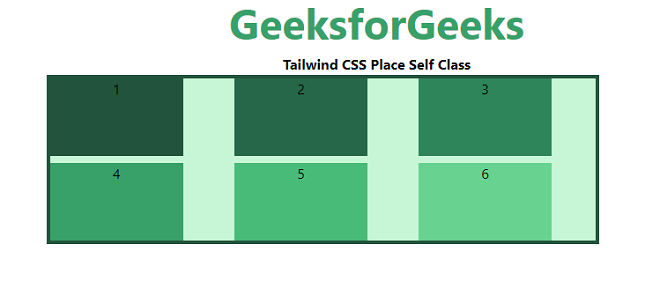
place-self-auto
Class này dùng khi các phần tử không có phần tử cha. Class này được dùng để định nghĩa vị trí tuyệt đối của phần tử.
Syntax:
<element class="place-self-auto">...</element>
Example:
HTML<!DOCTYPE html>
<html>
<head>
<link href=
"https://unpkg.com/tailwindcss@^1.0/dist/tailwind.min.css"
rel="stylesheet">
</head>
<body class="text-center">
<h1 class="text-green-600 text-5xl font-bold">
GeeksforGeeks
</h1>
<b>Tailwind CSS Place Self Class</b>
<div id="main" class="ml-24 h-48 w-2/3 grid grid-cols-3 gap-2
place-items-stretch
h-48 bg-green-200 border-solid border-4
border-green-900">
<div class="bg-green-900 w-3/4">1</div>
<div class="bg-green-800 place-self-auto w-3/4">2</div>
<div class="bg-green-700 w-3/4">3</div>
<div class="bg-green-600 w-3/4">4</div>
<div class="bg-green-500 w-3/4">5</div>
<div class="bg-green-400 w-3/4">6</div>
</div>
</body>
</html>
Output:
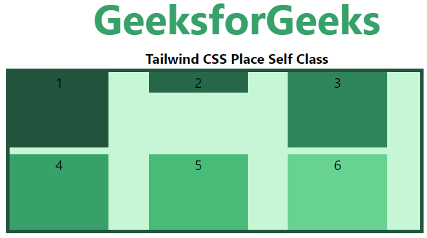
place-self-start
Class này được dùng để hiển thị các dòng ở đầu của flex container.
Syntax:
<element class="place-self-start">...</element>
Example:
HTML<!DOCTYPE html>
<html>
<head>
<link href=
"https://unpkg.com/tailwindcss@^1.0/dist/tailwind.min.css"
rel="stylesheet">
</head>
<body class="text-center">
<h1 class="text-green-600 text-5xl font-bold">
GeeksforGeeks
</h1>
<b>Tailwind CSS Place Self Class</b>
<div id="main" class="ml-24 h-48 w-2/3 grid grid-cols-3 gap-2
place-items-stretch
h-48 bg-green-200 border-solid border-4
border-green-900">
<div class="bg-green-900 w-3/4">1</div>
<div class="bg-green-800 place-self-start w-3/4">2</div>
<div class="bg-green-700 w-3/4">3</div>
<div class="bg-green-600 w-3/4">4</div>
<div class="bg-green-500 w-3/4">5</div>
<div class="bg-green-400 w-3/4">6</div>
</div>
</body>
</html>
Output:
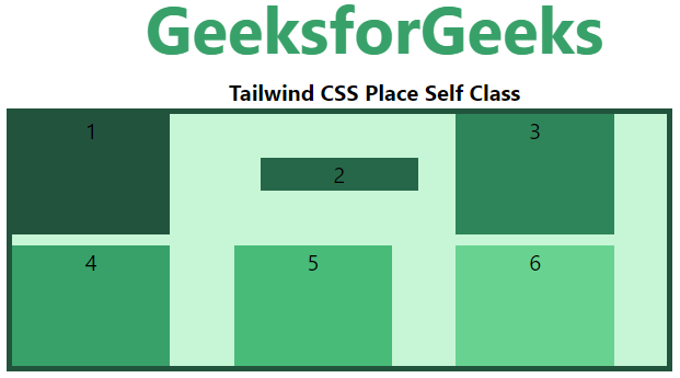
place-self-end
Class này dùng để hiển thị các dòng flex ở cuối flex container.
Syntax:
<element class="place-self-end">...</element>
Example:
HTML<!DOCTYPE html>
<html>
<head>
<link href=
"https://unpkg.com/tailwindcss@^1.0/dist/tailwind.min.css"
rel="stylesheet">
</head>
<body class="text-center">
<h1 class="text-green-600 text-5xl font-bold">
GeeksforGeeks
</h1>
<b>Tailwind CSS Place Self Class</b>
<div id="main" class="ml-24 h-48 w-2/3 grid grid-cols-3 gap-2
place-items-stretch
h-48 bg-green-200 border-solid border-4
border-green-900">
<div class="bg-green-900 w-3/4">1</div>
<div class="bg-green-800 place-self-end w-3/4">2</div>
<div class="bg-green-700 w-3/4">3</div>
<div class="bg-green-600 w-3/4">4</div>
<div class="bg-green-500 w-3/4">5</div>
<div class="bg-green-400 w-3/4">6</div>
</div>
</body>
</html>
Output:

place-self-center
Class này dùng để căn chỉnh các phần tử flex vào giữa container.
Syntax:
<element class="place-self-center">...</element>
Example:
HTML<!DOCTYPE html>
<html>
<head>
<link href=
"https://unpkg.com/tailwindcss@^1.0/dist/tailwind.min.css"
rel="stylesheet">
</head>
<body class="text-center">
<h1 class="text-green-600 text-5xl font-bold">
GeeksforGeeks
</h1>
<b>Tailwind CSS Place Self Class</b>
<div id="main" class="ml-24 h-48 w-2/3 grid grid-cols-3 gap-2
place-items-stretch
h-48 bg-green-200 border-solid border-4
border-green-900">
<div class="bg-green-900 w-3/4">1</div>
<div class="bg-green-800 place-self-center w-3/4">2</div>
<div class="bg-green-700 w-3/4">3</div>
<div class="bg-green-600 w-3/4">4</div>
<div class="bg-green-500 w-3/4">5</div>
<div class="bg-green-400 w-3/4">6</div>
</div>
</body>
</html>
Output:
place-self-stretch
Class này định nghĩa dòng được kéo dài để chiếm không gian còn lại. Của flex container. Đây là giá trị mặc định.
Syntax:
<element class="place-self-stretch">...</element>
Example:
HTML<!DOCTYPE html>
<html>
<head>
<link href=
"https://unpkg.com/tailwindcss@^1.0/dist/tailwind.min.css"
rel="stylesheet">
</head>
<body class="text-center">
<h1 class="text-green-600 text-5xl font-bold">
GeeksforGeeks
</h1>
<b>Tailwind CSS Place Self Class</b>
<div id="main" class="ml-24 h-48 w-2/3 grid grid-cols-3 gap-2
place-items-stretch
h-48 bg-green-200 border-solid border-4
border-green-900">
<div class="bg-green-900 w-3/4">1</div>
<div class="bg-green-800 place-self-stretch w-3/4">2</div>
<div class="bg-green-700 w-3/4">3</div>
<div class="bg-green-600 w-3/4">4</div>
<div class="bg-green-500 w-3/4">5</div>
<div class="bg-green-400 w-3/4">6</div>
</div>
</body>
</html>
Output: