Class này chấp nhận nhiều giá trị trong tailwind CSS. Nó là một giải pháp thay thế cho CSS Place Content property. Class này được dùng để kiểm soát cách nội dung được căn chỉnh. Đồng thời class này cũng để căn đều nội dung. Để đặt nhiều giá trị thuộc tính trong một class duy nhất. Class place-content có thể giữ giá trị của class align-content và justify-content.
Các Class Place Content:
- place-content-center
- place-content-start
- place-content-end
- place-content-between
- place-content-around
- place-content-evenly
- place-content-stretch
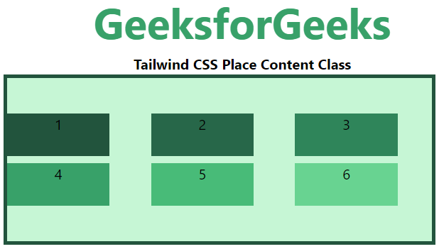
place-content-center
Class này căn chỉnh các mục flex vào giữa vùng chứa.
Cú pháp:
<element class="place-content-center">...</element>
Ví dụ:
HTML<!DOCTYPE html>
<html>
<head>
<link href=
"https://unpkg.com/tailwindcss@^1.0/dist/tailwind.min.css"
rel="stylesheet">
</head>
<body class="text-center">
<h1 class="text-green-600 text-5xl font-bold">
GeeksforGeeks
</h1>
<b>Tailwind CSS Place Content Class</b>
<div id="main" class="ml-24 h-48 w-2/3 grid grid-cols-3 gap-2
place-content-center
h-48 bg-green-200 border-solid border-4
border-green-900">
<div class="bg-green-900 w-3/4 h-12">1</div>
<div class="bg-green-800 w-3/4 h-12">2</div>
<div class="bg-green-700 w-3/4 h-12">3</div>
<div class="bg-green-600 w-3/4 h-12">4</div>
<div class="bg-green-500 w-3/4 h-12">5</div>
<div class="bg-green-400 w-3/4 h-12">6</div>
</div>
</body>
</html>
Đầu ra:
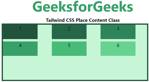
place-content-start
Class này căn chỉnh các mục flex ở đầu vùng chứa.
Cú pháp:
<element class="place-content-start">...</element>
Ví dụ:
HTML<!DOCTYPE html>
<html>
<head>
<link href=
"https://unpkg.com/tailwindcss@^1.0/dist/tailwind.min.css"
rel="stylesheet">
</head>
<body class="text-center">
<h1 class="text-green-600 text-5xl font-bold">
GeeksforGeeks
</h1>
<b>Tailwind CSS Place Content Class</b>
<div id="main" class="ml-24 h-48 w-2/3 grid grid-cols-3 gap-2
place-content-start
h-48 bg-green-200 border-solid border-4
border-green-900">
<div class="bg-green-900 w-3/4 h-12">1</div>
<div class="bg-green-800 w-3/4 h-12">2</div>
<div class="bg-green-700 w-3/4 h-12">3</div>
<div class="bg-green-600 w-3/4 h-12">4</div>
<div class="bg-green-500 w-3/4 h-12">5</div>
<div class="bg-green-400 w-3/4 h-12">6</div>
</div>
</body>
</html>
Đầu ra:
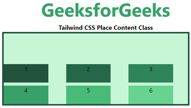
place-content-end
Class này căn chỉnh các mục flex ở cuối vùng chứa.
Cú pháp:
<element class="place-content-end">...</element>
Ví dụ:
HTML<!DOCTYPE html>
<html>
<head>
<link href=
"https://unpkg.com/tailwindcss@^1.0/dist/tailwind.min.css"
rel="stylesheet">
</head>
<body class="text-center">
<h1 class="text-green-600 text-5xl font-bold">
GeeksforGeeks
</h1>
<b>Tailwind CSS Place Content Class</b>
<div id="main" class="ml-24 h-48 w-2/3 grid grid-cols-3 gap-2
place-content-end
h-48 bg-green-200 border-solid border-4
border-green-900">
<div class="bg-green-900 w-3/4 h-12">1</div>
<div class="bg-green-800 w-3/4 h-12">2</div>
<div class="bg-green-700 w-3/4 h-12">3</div>
<div class="bg-green-600 w-3/4 h-12">4</div>
<div class="bg-green-500 w-3/4 h-12">5</div>
<div class="bg-green-400 w-3/4 h-12">6</div>
</div>
</body>
</html>
Đầu ra:
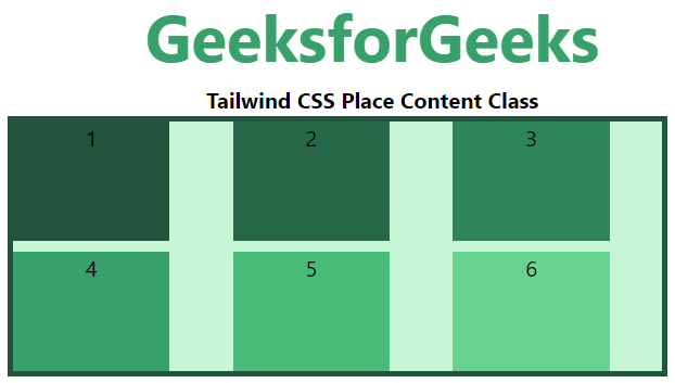
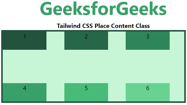
place-content-between
Class này phân phối không gian giữa các dòng flex bằng nhau.
Cú pháp:
<element class="place-content-between">...</element>
Ví dụ:
HTML<!DOCTYPE html>
<html>
<head>
<link href=
"https://unpkg.com/tailwindcss@^1.0/dist/tailwind.min.css"
rel="stylesheet">
</head>
<body class="text-center">
<h1 class="text-green-600 text-5xl font-bold">
GeeksforGeeks
</h1>
<b>Tailwind CSS Place Content Class</b>
<div id="main" class="ml-24 h-48 w-2/3 grid grid-cols-3 gap-2
place-content-between
h-48 bg-green-200 border-solid border-4
border-green-900">
<div class="bg-green-900 w-3/4 h-12">1</div>
<div class="bg-green-800 w-3/4 h-12">2</div>
<div class="bg-green-700 w-3/4 h-12">3</div>
<div class="bg-green-600 w-3/4 h-12">4</div>
<div class="bg-green-500 w-3/4 h-12">5</div>
<div class="bg-green-400 w-3/4 h-12">6</div>
</div>
</body>
</html>
Đầu ra:
place-content-around
Class này phân phối không gian đều nhau xung quanh các dòng flex.
Cú pháp:
<element class="place-content-around">...</element>
Ví dụ:
HTML<!DOCTYPE html>
<html>
<head>
<link href=
"https://unpkg.com/tailwindcss@^1.0/dist/tailwind.min.css"
rel="stylesheet">
</head>
<body class="text-center">
<h1 class="text-green-600 text-5xl font-bold">
GeeksforGeeks
</h1>
<b>Tailwind CSS Place Content Class</b>
<div id="main" class="ml-24 h-48 w-2/3 grid grid-cols-3 gap-2
place-content-around
h-48 bg-green-200 border-solid border-4
border-green-900">
<div class="bg-green-900 w-3/4 h-12">1</div>
<div class="bg-green-800 w-3/4 h-12">2</div>
<div class="bg-green-700 w-3/4 h-12">3</div>
<div class="bg-green-600 w-3/4 h-12">4</div>
<div class="bg-green-500 w-3/4 h-12">5</div>
<div class="bg-green-400 w-3/4 h-12">6</div>
</div>
</body>
</html>
Đầu ra:
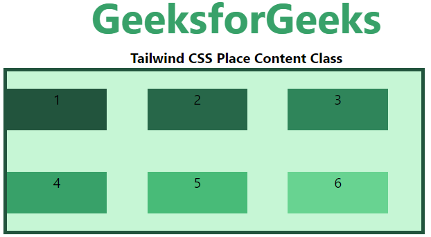
place-content-evenly
Class này định nghĩa vị trí với khoảng cách bằng nhau giữa chúng. Tuy nhiên khoảng cách từ các góc lại khác nhau.
Cú pháp:
<element class="place-content-evenly">...</element>
Ví dụ:
HTML<!DOCTYPE html>
<html>
<head>
<link href=
"https://unpkg.com/tailwindcss@^1.0/dist/tailwind.min.css"
rel="stylesheet">
</head>
<body class="text-center">
<h1 class="text-green-600 text-5xl font-bold">
GeeksforGeeks
</h1>
<b>Tailwind CSS Place Content Class</b>
<div id="main" class="ml-24 h-48 w-2/3 grid grid-cols-3 gap-2
place-content-evenly
h-48 bg-green-200 border-solid border-4
border-green-900">
<div class="bg-green-900 w-3/4 h-12">1</div>
<div class="bg-green-800 w-3/4 h-12">2</div>
<div class="bg-green-700 w-3/4 h-12">3</div>
<div class="bg-green-600 w-3/4 h-12">4</div>
<div class="bg-green-500 w-3/4 h-12">5</div>
<div class="bg-green-400 w-3/4 h-12">6</div>
</div>
</body>
</html>
Đầu ra:
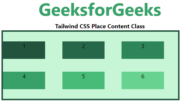
place-content-stretch
Class này định nghĩa dòng được kéo dài để chiếm không gian còn lại. Nó là giá trị mặc định của flex container.
Cú pháp:
<element class="place-content-evenly">...</element>
Ví dụ:
HTML<!DOCTYPE html>
<html>
<head>
<link href=
"https://unpkg.com/tailwindcss@^1.0/dist/tailwind.min.css"
rel="stylesheet">
</head>
<body class="text-center">
<h1 class="text-green-600 text-5xl font-bold">
GeeksforGeeks
</h1>
<b>Tailwind CSS Place Content Class</b>
<div id="main" class="ml-24 h-48 w-2/3 grid grid-cols-3 gap-2
place-content-stretch
h-48 bg-green-200 border-solid border-4
border-green-900">
<div class="bg-green-900 w-3/4">1</div>
<div class="bg-green-800 w-3/4">2</div>
<div class="bg-green-700 w-3/4">3</div>
<div class="bg-green-600 w-3/4">4</div>
<div class="bg-green-500 w-3/4">5</div>
<div class="bg-green-400 w-3/4">6</div>
</div>
</body>
</html>
Đầu ra: