Lớp này chấp nhận nhiều giá trị trong tailwind CSS. Tất cả thuộc tính được bao phủ dưới dạng lớp. Nó là một lựa chọn thay thế cho thuộc tính CSS grid-auto-columns property.
Lớp này dùng để chỉ định kích thước cho các cột của vùng chứa lưới được tạo ngầm. Lớp này được dùng để kiểm soát kích thước cột lưới được tạo tự động.
Các lớp Grid Auto columns:
- auto-cols-auto
- auto-cols-min
- auto-cols-max
- auto-cols-fr
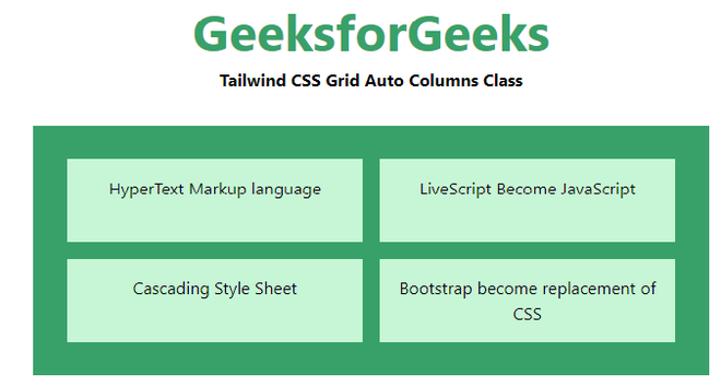
auto-cols-auto: Đây là giá trị mặc định. Kích thước được xác định ngầm dựa theo kích thước vùng chứa.
Cú pháp:
<element class="auto-cols-auto">..</element>
Ví dụ:
HTML<!DOCTYPE html>
<html>
<head>
<link href=
"https://unpkg.com/tailwindcss@^1.0/dist/tailwind.min.css"
rel="stylesheet">
</head>
<body class="text-center">
<h1 class="text-green-600 text-5xl font-bold">
GeeksforGeeks
</h1>
<b>Tailwind CSS Grid Auto Columns Class</b>
<div class ="m-8 p-8 grid bg-green-600 grid-rows-2
grid-flow-col gap-4 auto-cols-auto">
<div class = "p-4 bg-green-200">
HyperText Markup language
</div>
<div class = "p-4 bg-green-200">
Cascading Style Sheet
</div>
<div class = "p-4 bg-green-200">
LiveScript Become JavaScript
</div>
<div class = "p-4 bg-green-200">
Bootstrap become replacement of CSS
</div>
</div>
</body>
</html>
Đầu ra:
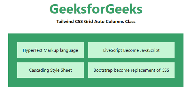
auto-cols-min: Nó chỉ định kích thước phụ thuộc vào mục nhỏ nhất trong vùng chứa.
Cú pháp:
<element class="auto-cols-min">..</element>
Ví dụ:
HTML<!DOCTYPE html>
<html>
<head>
<link href=
"https://unpkg.com/tailwindcss@^1.0/dist/tailwind.min.css"
rel="stylesheet">
</head>
<body class="text-center">
<h1 class="text-green-600 text-5xl font-bold">
GeeksforGeeks
</h1>
<b>Tailwind CSS Grid Auto Columns Class</b>
<div class ="m-8 p-8 grid bg-green-600 grid-rows-2
grid-flow-col gap-4 auto-cols-min">
<div class = "p-4 bg-green-200">
HyperText Markup language
</div>
<div class = "p-4 bg-green-200">
Cascading Style Sheet
</div>
<div class = "p-4 bg-green-200">
LiveScript Become JavaScript
</div>
<div class = "p-4 bg-green-200">
Bootstrap become replacement of CSS
</div>
</div>
</body>
</html>
Đầu ra:
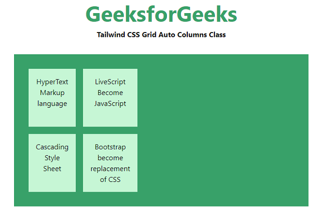
auto-cols-max: Nó chỉ định kích thước phụ thuộc vào mục lớn nhất trong vùng chứa.
Cú pháp:
<element class="auto-cols-max">..</element>
Ví dụ:
HTML<!DOCTYPE html>
<html>
<head>
<link href=
"https://unpkg.com/tailwindcss@^1.0/dist/tailwind.min.css"
rel="stylesheet">
</head>
<body class="text-center">
<h1 class="text-green-600 text-5xl font-bold">
GeeksforGeeks
</h1>
<b>Tailwind CSS Grid Auto Columns Class</b>
<div class ="m-8 p-8 grid bg-green-600 grid-rows-2
grid-flow-col gap-4 auto-cols-max">
<div class = "p-4 bg-green-200">
HyperText Markup language
</div>
<div class = "p-4 bg-green-200">
Cascading Style Sheet
</div>
<div class = "p-4 bg-green-200">
LiveScript Become JavaScript
</div>
<div class = "p-4 bg-green-200">
Bootstrap become replacement of CSS
</div>
</div>
</body>
</html>
Đầu ra:
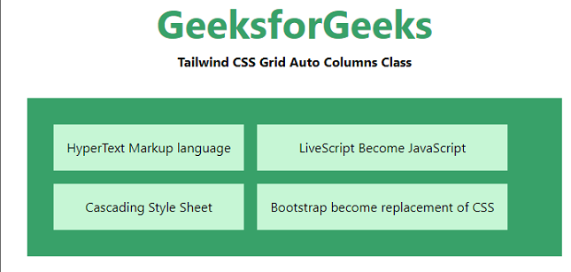
auto-cols-fr: Nó chỉ định kích thước trong khoảng [min, max]. Giá trị phải lớn hơn hoặc bằng min và nhỏ hơn hoặc bằng max.
Cú pháp:
<element class="auto-cols-fr">..</element>
Ví dụ:
HTML<!DOCTYPE html>
<html>
<head>
<link href=
"https://unpkg.com/tailwindcss@^1.0/dist/tailwind.min.css"
rel="stylesheet">
</head>
<body class="text-center">
<h1 class="text-green-600 text-5xl font-bold">
GeeksforGeeks
</h1>
<b>Tailwind CSS Grid Auto Columns Class</b>
<div class ="m-8 p-8 grid bg-green-600 grid-rows-2
grid-flow-col gap-4 auto-cols-fr">
<div class = "p-4 bg-green-200">
HyperText Markup language
</div>
<div class = "p-4 bg-green-200">
Cascading Style Sheet
</div>
<div class = "p-4 bg-green-200">
LiveScript Become JavaScript
</div>
<div class = "p-4 bg-green-200">
Bootstrap become replacement of CSS
</div>
</div>
</body>
</html>
Đầu ra: