Tailwind CSS Flex Shrink cung cấp các tiện ích để kiểm soát việc thu nhỏ các flex item.
Syntax:
class= "flex-shrink-0"
Flex shrink Values:
- flex-shrink-0: Class này được dùng để ngăn việc thu nhỏ của một phần tử.
- flex-shrink: Class này được dùng để thu nhỏ một phần tử..
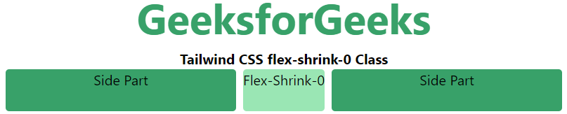
Example 1: Ví dụ này cho thấy cách sử dụng class flex-shrink-0 của Tailwind CSS.
HTML<!DOCTYPE html>
<html>
<head>
<title>Tailwind flex-shrink-0 Class</title>
<link href=
"https://unpkg.com/tailwindcss@^1.0/dist/tailwind.min.css"
rel="stylesheet">
</head>
<body class="text-center">
<h1 class="text-green-600 text-5xl font-bold">
GeeksforGeeks
</h1>
<b>Tailwind CSS flex-shrink-0 Class</b>
<div id="main" class="flex justify-evenly space-x-2 ml-12 mr-12">
<div class="rounded bg-green-600 flex-1 h-12 ">
Side Part</div>
<div class="rounded bg-green-300 flex-shrink-0 h-12">
Flex-Shrink-0
</div>
<div class="rounded bg-green-600 flex-1 h-12 mr-12">
Side Part</div>
</div>
</body>
</html>
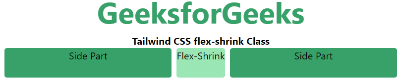
Output:
Example 2: Ví dụ này trình bày việc sử dụng class flex-shrink của Tailwind CSS.
HTML<!DOCTYPE html>
<html>
<head>
<title>Tailwind flex-shrink Class</title>
<link href=
"https://unpkg.com/tailwindcss@^1.0/dist/tailwind.min.css"
rel="stylesheet">
</head>
<body class="text-center">
<h1 class="text-green-600 text-5xl font-bold">
GeeksforGeeks
</h1>
<b>Tailwind CSS flex-shrink Class</b>
<div id="main" class="flex justify-evenly space-x-2 ml-12 mr-12">
<div class="rounded bg-green-600 flex-grow w-16 h-12 ">
Side Part</div>
<div class="rounded bg-green-300 flex-shrink h-12">
Flex-Shrink
</div>
<div class="rounded bg-green-600 flex-grow w-16 h-12">
Side Part</div>
</div>
</body>
</html>
Output: