CSS flexbox là một tính năng quan trọng để phát triển giao diện người dùng. Tailwind CSS cung cấp bốn tùy chọn flex có sẵn dưới dạng class. Nó là một giải pháp thay thế cho CSS flex Property để phát triển giao diện nhanh chóng. Nó được dùng để thiết lập độ dài của các phần tử linh hoạt. Class flex rất linh hoạt và thân thiện với thiết bị di động. Nó giúp định vị các phần tử con và container chính dễ dàng. Margin không bị thu gọn với margin của nội dung. Thứ tự của bất kỳ phần tử nào có thể dễ dàng thay đổi mà không cần chỉnh sửa phần HTML.
Flex:
- flex-1
- flex-initial
- flex-auto
- flex-none
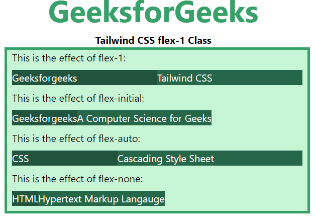
flex-1: Một tỷ lệ chỉ định mức độ các phần tử sẽ tăng trưởng so với phần còn lại. Nó cho phép một phần tử flex tăng và co lại khi cần thiết bỏ qua kích thước ban đầu.
Syntax:
<element class="flex-1"> Contents... </element>
Example:
HTML<!DOCTYPE html>
<html>
<head>
<title>Tailwind flex-1 Class</title>
<link href=
"https://unpkg.com/tailwindcss@^1.0/dist/tailwind.min.css"
rel="stylesheet">
</head>
<body>
<h1 class="text-center text-green-600 text-5xl font-bold">
GeeksforGeeks
</h1>
<p class="text-center font-bold">Tailwind CSS flex-1 Class</p>
<div id="main" class="bg-green-200 border-4
border-green-600 w-2/3 ml-32">
<p class="ml-2">This is the effect of flex-1:</p>
<div class="flex m-2 text-white">
<div class="bg-green-900 flex-1">
Geeksforgeeks
</div>
<div class="bg-green-800 flex-1">
Tailwind CSS
</div>
</div>
<p class="ml-2">
This is the effect of flex-initial:
</p>
<div class="flex m-2 text-white">
<div class="bg-green-900 flex-initial">
Geeksforgeeks
</div>
<div class="bg-green-800 flex-initial">
A Computer Science for Geeks
</div>
</div>
<p class="ml-2">
This is the effect of flex-auto:
</p>
<div class="flex m-2 text-white">
<div class="bg-green-900 flex-auto">
CSS
</div>
<div class="bg-green-800 flex-auto">
Cascading Style Sheet
</div>
</div>
<p class="ml-2">
This is the effect of flex-none:
</p>
<div class="flex m-2 text-white">
<div class="bg-green-900 flex-none">
HTML
</div>
<div class="bg-green-800 flex-none">
Hypertext Markup Language
</div>
</div>
</div>
</body>
</html>
Output:
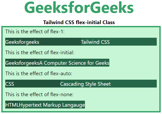
flex-initial: Class này xác định mức độ một phần tử sẽ tăng so với các phần tử linh hoạt khác. Nó cho phép một phần tử flex co lại nhưng không tăng lên có tính đến kích thước ban đầu.
Syntax:
<element class="flex-initial">..</element>
Example:
HTML<!DOCTYPE html>
<html>
<head>
<title>Tailwind flex-initial Class</title>
<link href=
"https://unpkg.com/tailwindcss@^1.0/dist/tailwind.min.css"
rel="stylesheet">
</head>
<body>
<h1 class="text-center text-green-600 text-5xl font-bold">
GeeksforGeeks
</h1>
<p class="text-center font-bold">Tailwind CSS flex-initial Class</p>
<div id="main" class="bg-green-200 border-4
border-green-600 w-2/3 ml-32">
<p class="ml-2">This is the effect of flex-1:</p>
<div class="flex m-2 text-white">
<div class="bg-green-900 flex-1">
Geeksforgeeks
</div>
<div class="bg-green-800 flex-1">
Tailwind CSS
</div>
</div>
<p class="ml-2">
This is the effect of flex-initial:
</p>
<div class="flex m-2 text-white">
<div class="bg-green-900 flex-initial">
Geeksforgeeks
</div>
<div class="bg-green-800 flex-initial">
A Computer Science for Geeks
</div>
</div>
<p class="ml-2">
This is the effect of flex-auto:
</p>
<div class="flex m-2 text-white">
<div class="bg-green-900 flex-auto">
CSS
</div>
<div class="bg-green-800 flex-auto">
Cascading Style Sheet
</div>
</div>
<p class="ml-2">
This is the effect of flex-none:
</p>
<div class="flex m-2 text-white">
<div class="bg-green-900 flex-none">
HTML
</div>
<div class="bg-green-800 flex-none">
Hypertext Markup Language
</div>
</div>
</div>
</body>
</html>
Output:
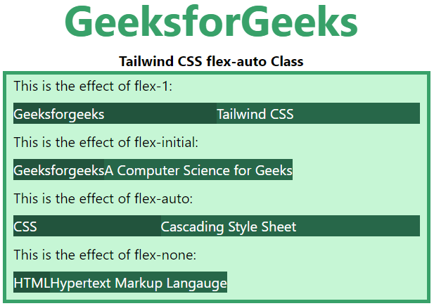
flex-auto: Class này chỉ định mức độ một phần tử sẽ tăng so với nội dung của các phần tử flex khác. Nó cho phép một phần tử flex tăng và co lại khi cần thiết, bỏ qua kích thước ban đầu.
Syntax:
<element class="flex-auto"> Contents... </element>
Example:
HTML<!DOCTYPE html>
<html>
<head>
<title>Tailwind flex-auto Class</title>
<link href=
"https://unpkg.com/tailwindcss@^1.0/dist/tailwind.min.css"
rel="stylesheet">
</head>
<body>
<h1 class="text-center text-green-600 text-5xl font-bold">
GeeksforGeeks
</h1>
<p class="text-center font-bold">Tailwind CSS flex-auto Class</p>
<div id="main" class="bg-green-200 border-4
border-green-600 w-2/3 ml-32">
<p class="ml-2">This is the effect of flex-1:</p>
<div class="flex m-2 text-white">
<div class="bg-green-900 flex-1">
Geeksforgeeks
</div>
<div class="bg-green-800 flex-1">
Tailwind CSS
</div>
</div>
<p class="ml-2">
This is the effect of flex-initial:
</p>
<div class="flex m-2 text-white">
<div class="bg-green-900 flex-initial">
Geeksforgeeks
</div>
<div class="bg-green-800 flex-initial">
A Computer Science for Geeks
</div>
</div>
<p class="ml-2">
This is the effect of flex-auto:
</p>
<div class="flex m-2 text-white">
<div class="bg-green-900 flex-auto">
CSS
</div>
<div class="bg-green-800 flex-auto">
Cascading Style Sheet
</div>
</div>
<p class="ml-2">
This is the effect of flex-none:
</p>
<div class="flex m-2 text-white">
<div class="bg-green-900 flex-none">
HTML
</div>
<div class="bg-green-800 flex-none">
Hypertext Markup Language
</div>
</div>
</div>
</body>
</html>
Output:
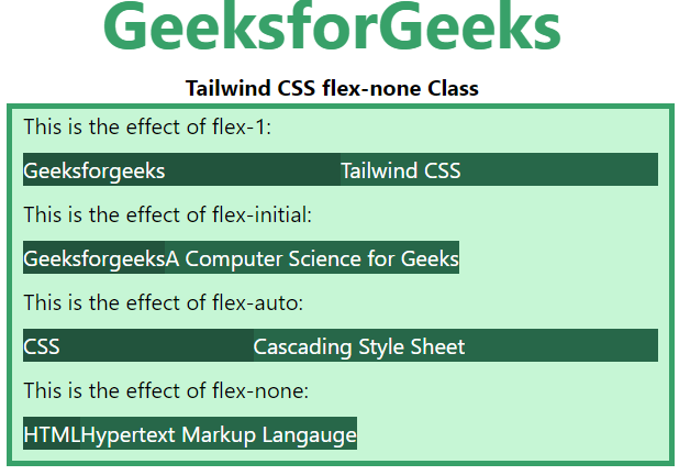
flex-none: Class này đặt giới hạn cho việc tăng hoặc giảm kích thước phần tử khi có thêm không gian. Điều này ngăn một phần tử flex tăng hoặc giảm, nó chỉ chiếm không gian theo kích thước nội dung.
Syntax:
<element class="flex-none">..</element>
Example:
HTML<!DOCTYPE html>
<html>
<head>
<title>Tailwind flex-none Class</title>
<link href=
"https://unpkg.com/tailwindcss@^1.0/dist/tailwind.min.css"
rel="stylesheet">
</head>
<body>
<h1 class="text-center text-green-600 text-5xl font-bold">
GeeksforGeeks
</h1>
<p class="text-center font-bold">Tailwind CSS flex-none Class</p>
<div id="main" class="bg-green-200 border-4
border-green-600 w-2/3 ml-32">
<p class="ml-2">This is the effect of flex-1:</p>
<div class="flex m-2 text-white">
<div class="bg-green-900 flex-1">
Geeksforgeeks
</div>
<div class="bg-green-800 flex-1">
Tailwind CSS
</div>
</div>
<p class="ml-2">
This is the effect of flex-initial:
</p>
<div class="flex m-2 text-white">
<div class="bg-green-900 flex-initial">
Geeksforgeeks
</div>
<div class="bg-green-800 flex-initial">
A Computer Science for Geeks
</div>
</div>
<p class="ml-2">
This is the effect of flex-auto:
</p>
<div class="flex m-2 text-white">
<div class="bg-green-900 flex-auto">
CSS
</div>
<div class="bg-green-800 flex-auto">
Cascading Style Sheet
</div>
</div>
<p class="ml-2">
This is the effect of flex-none:
</p>
<div class="flex m-2 text-white">
<div class="bg-green-900 flex-none">
HTML
</div>
<div class="bg-green-800 flex-none">
Hypertext Markup Language
</div>
</div>
</div>
</body>
</html>
Output: