Class Drop Shadow dùng để áp dụng filter lên ảnh, tạo hiệu ứng đổ bóng. Class này tạo bóng mờ với offset và màu sắc cho trước. Trong CSS, ta dùng CSS drop-shadow() Function. Tailwind CSS đã thêm thuộc tính brightness trong phiên bản 2.1.
Drop Shadow:
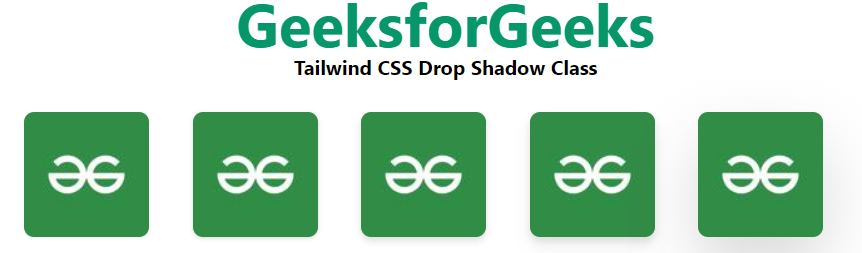
- drop-shadow-sm: Class này dùng để tạo hiệu ứng bóng đổ nhỏ.
- drop-shadow: Class này dùng để tạo hiệu ứng bóng đổ thông thường.
- drop-shadow-md: Class này dùng để tạo hiệu ứng bóng đổ vừa.
- drop-shadow-lg: Class này dùng để tạo hiệu ứng bóng đổ lớn.
- drop-shadow-xl: Class này dùng để tạo hiệu ứng bóng đổ siêu lớn.
- drop-shadow-2xl: Class này dùng để tạo hiệu ứng bóng đổ cực lớn.
- drop-shadow-none: Class này dùng để loại bỏ hiệu ứng bóng đổ.
Syntax:
<element class="filter drop-shadow-{amount}">..</element>
Example:
HTML<!DOCTYPE html>
<html>
<head>
<link href=
"https://unpkg.com/tailwindcss@^2.1/dist/tailwind.min.css"
rel="stylesheet">
</head>
<body class="text-center mx-4 space-y-2">
<h1 class="text-green-600 text-5xl font-bold">
GeeksforGeeks
</h1>
<b>Tailwind CSS Drop Shadow Class</b>
<div class="grid grid-flow-col text-center p-4">
<img class="rounded-lg filter drop-shadow-sm"
src=
"https://media.geeksforgeeks.org/wp-content/uploads/20210604014825/QNHrwL2q-100x100.jpg"
alt="image">
<img class="rounded-lg filter drop-shadow"
src=
"https://media.geeksforgeeks.org/wp-content/uploads/20210604014825/QNHrwL2q-100x100.jpg"
alt="image">
<img class="rounded-lg filter drop-shadow-md"
src=
"https://media.geeksforgeeks.org/wp-content/uploads/20210604014825/QNHrwL2q-100x100.jpg"
alt="image">
<img class="rounded-lg filter drop-shadow-lg"
src=
"https://media.geeksforgeeks.org/wp-content/uploads/20210604014825/QNHrwL2q-100x100.jpg"
alt="image">
<img class="rounded-lg filter drop-shadow-2xl"
src=
"https://media.geeksforgeeks.org/wp-content/uploads/20210604014825/QNHrwL2q-100x100.jpg"
alt="image">
</div>
</body>
</html>
Output: