Thuộc tính shape-image-threshold dùng để thiết lập ngưỡng kênh alpha. Ngưỡng này được dùng để trích xuất hình dạng khi dùng ảnh cho shape-outside.
Cú pháp:
shape-image-threshold: <alpha-value>
Giá trị thuộc tính:
- alpha-value: Dùng để đặt ngưỡng trích xuất hình dạng. Các pixel lớn hơn giá trị ngưỡng sẽ được xem xét cho hình dạng. Một giá trị thập phân từ 0.0 đến 1.0 có thể dùng để đặt ngưỡng. Ngưỡng này đi từ hoàn toàn trong suốt đến hoàn toàn mờ đục. Nếu giá trị nằm ngoài phạm vi, chúng sẽ bị giới hạn trong phạm vi này.
Các ví dụ dưới đây minh họa thuộc tính shape-image-threshold:
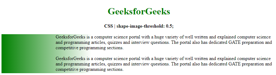
Ví dụ 1: Trong ví dụ này, chúng ta sẽ đặt ngưỡng thành 0.5
HTML<!DOCTYPE html>
<html>
<head>
<title>
CSS | shape-image-threshold
</title>
<style>
.outline {
shape-outside: linear-gradient(
to right, green, transparent);
/* shape-image-threshold effect */
shape-image-threshold: 0.4;
background-image: linear-gradient(
to right, green, transparent);
width: 300px;
height: 130px;
float: left;
}
</style>
</head>
<body>
<center>
<h1 style="color: green">
GeeksforGeeks
</h1>
<b>
CSS | shape-image-threshold: 0.5;
</b>
<br><br>
</center>
<div class="outline"></div>
<div class="container">
GeeksforGeeks is a computer science portal
with a huge variety of well written and
explained computer science and programming
articles, quizzes and interview questions.
The portal also has dedicated GATE preparation
and competitive programming sections.
<br><br>
GeeksforGeeks is a computer science portal
with a huge variety of well written and
explained computer science and programming
articles, quizzes and interview questions.
The portal also has dedicated GATE preparation
and competitive programming sections.
</div>
</body>
</html>
Đầu ra:
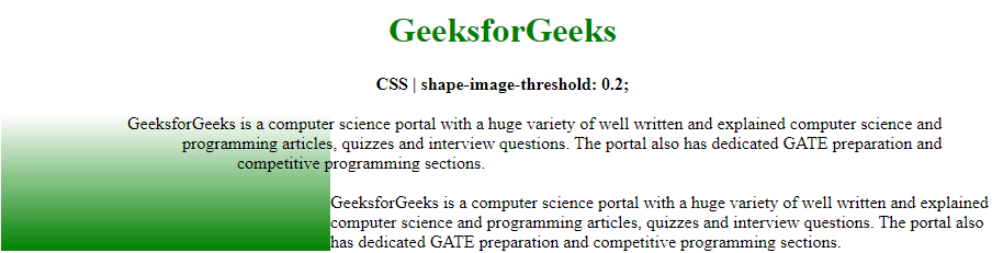
Ví dụ 2: Trong ví dụ này, chúng ta sẽ đặt ngưỡng thành 0.2
HTML<!DOCTYPE html>
<html>
<head>
<title>
CSS | shape-image-threshold
</title>
<style>
.outline {
shape-outside: linear-gradient(20deg,
rgb(77, 26, 103), transparent 80%,
transparent);
/* shape-image-threshold effect */
shape-image-threshold: 0.2;
background-image: linear-gradient(
to top, green, transparent);
width: 300px;
height: 125px;
float: left;
}
</style>
</head>
<body>
<center>
<h1 style="color: green">
GeeksforGeeks
</h1>
<b>
CSS | shape-image-threshold: 0.2;
</b>
<br><br>
</center>
<div class="outline"></div>
<div class="container">
GeeksforGeeks is a computer science portal
with a huge variety of well written and
explained computer science and programming
articles, quizzes and interview questions.
The portal also has dedicated GATE preparation
and competitive programming sections.
<br><br>
GeeksforGeeks is a computer science portal
with a huge variety of well written and
explained computer science and programming
articles, quizzes and interview questions.
The portal also has dedicated GATE preparation
and competitive programming sections.
</div>
</body>
</html>
Đầu ra:
Trình duyệt được hỗ trợ: Các trình duyệt hỗ trợ thuộc tính shape-image-threshold được liệt kê dưới đây:
- Google Chrome 37+
- Edge 79+
- Firefox 62+
- Safari 10.1+
- Opera 24+