Thuộc tính flex-shrink trong CSS định nghĩa cách một flex item co lại so với các item khác. Điều này quan trọng cho responsive design, vì nó cho phép các phần tử điều chỉnh kích thước linh hoạt theo không gian.
Note: Nếu item trong container không linh hoạt, thuộc tính flex-shrink sẽ không ảnh hưởng đến item đó.
Syntax
flex-shrink: <number> | initial | inherit;
Default Value: 1
Property values
Property Value | Description |
|---|---|
number | Một số xác định mức độ co lại của item so với các item linh hoạt khác. |
initial | Nó đặt giá trị về giá trị mặc định của nó. |
inherit | Nó kế thừa thuộc tính từ các phần tử cha của nó. |
Examples of CSS flex-shrink Property
Dưới đây là một vài ví dụ cơ bản về cách thuộc tính CSS flex-shrink hoạt động:
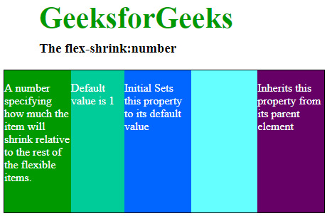
Example 1: Basic Usage of flex-shrink
Trong ví dụ này, chúng ta sẽ xem thuộc tính flex-shrink hoạt động trong một flex container. Div thứ hai có giá trị shrink cao hơn (flex-shrink: 4). Do đó, nó co lại nhiều hơn những div khác khi không gian hạn chế. Nó giúp kiểm soát mức độ co lại của mỗi item.
HTML<!DOCTYPE html>
<html>
<head>
<title>
CSS flex-shrink Property
</title>
<style>
#main {
width: 450px;
height: 200px;
border: 1px solid black;
display: -webkit-flex;
display: flex;
color: white;
}
h1 {
color: #009900;
font-size: 42px;
margin-left: 50px;
}
h3 {
margin-top: -20px;
margin-left: 50px;
}
#main div {
flex-grow: 1;
flex-shrink: 1;
flex-basis: 100px;
}
/* shrinking the 2nd div compare to others */
#main div:nth-of-type(2) {
flex-shrink: 4;
}
</style>
</head>
<body>
<h1>GeeksforGeeks</h1>
<h3>The flex-shrink:number</h3>
<!-- Making 5 divs in main -->
<div id="main">
<div style="background-color:#009900;">
<p>
A number specifying how much the item
will shrink relative to the rest of the
flexible items.
</p>
</div>
<div style="background-color:#00cc99;">
<p> Default value is 1</p>
</div>
<div style="background-color:#0066ff;">
<p>
Initial Sets this property to
its default value
</p>
</div>
<div style="background-color:#66ffff;;"></div>
<div style="background-color:#660066;">
<p>
Inherits this property from
its parent element
</p>
</div>
</div>
</body>
</html>
Output:
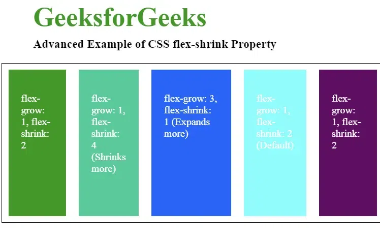
Example 2: Advanced Usage of flex-shrink with flex-grow
Trong ví dụ này, ta thấy flex-shrink và flex-grow hoạt động trong flex container. Nó giúp tạo bố cục responsive. Các item co lại khi không gian bị hạn chế. Chúng mở rộng khi có thêm không gian.
HTML<!DOCTYPE html>
<html>
<head>
<title>
CSS Advanced flex-shrink Property
</title>
<style>
#main {
width: 600px;
height: 250px;
border: 1px solid black;
display: flex;
color: white;
justify-content: space-around;
}
h1 {
color: #009900;
font-size: 42px;
margin-left: 50px;
}
h3 {
margin-top: -20px;
margin-left: 50px;
}
#main div {
flex-grow: 1;
flex-shrink: 2;
flex-basis: 120px;
margin: 10px;
padding: 20px;
}
/* Second div shrinks 4x more compared to others */
#main div:nth-of-type(2) {
flex-shrink: 4;
}
/* Third div expands more and shrinks less */
#main div:nth-of-type(3) {
flex-grow: 3;
flex-shrink: 1;
}
</style>
</head>
<body>
<h1>GeeksforGeeks</h1>
<h3>Advanced Example of CSS flex-shrink Property</h3>
<!-- Flex container with 5 div elements -->
<div id="main">
<div style="background-color:#009900;">
<p>
flex-grow: 1, flex-shrink: 2
</p>
</div>
<div style="background-color:#00cc99;">
<p> flex-grow: 1, flex-shrink: 4 (Shrinks more)</p>
</div>
<div style="background-color:#0066ff;">
<p> flex-grow: 3, flex-shrink: 1 (Expands more)</p>
</div>
<div style="background-color:#66ffff;">
<p> flex-grow: 1, flex-shrink: 2 (Default)</p>
</div>
<div style="background-color:#660066;">
<p> flex-grow: 1, flex-shrink: 2</p>
</div>
</div>
</body>
</html>
Output :
Supported Browser
Các trình duyệt được hỗ trợ bởi CSS flex-shrink Property được liệt kê dưới đây:
- Google Chrome 5.0
- Edge 12
- Mozilla 4.0
- Safari 5.0
- Opera 11.1