Thuộc tính flex-flow là một thuộc tính con của module flexible box layout. Nó cũng là thuộc tính viết tắt cho flex-wrap và flex-direction.
Lưu ý:
Thuộc tính flex sẽ không có tác dụng khi phần tử không phải là một flex item.
Cú pháp:
flex-flow: flex-direction flex-wrap;
Các giá trị của thuộc tính flex-flow:
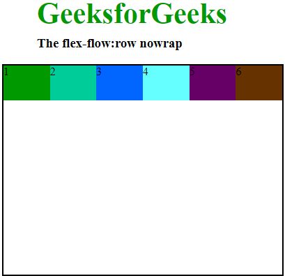
row nowrap: Nó sắp xếp hàng giống như hướng văn bản và giá trị mặc định của wrap-flex là nowrap. Nó chỉ định rằng các item không được phép xuống hàng. Các item sẽ được hiển thị trên một dòng duy nhất.Cú pháp:
flex-flow: row nowrap;Ví dụ: html
<!DOCTYPE html>
<head>
    <title>flex-flow property</title>
    <style>
        #main {
            width: 400px;
            height: 300px;
            border: 2px solid black;
            display: flex;
            flex-flow: row nowrap;
        }

        #main div {
            width: 100px;
            height: 50px;
        }

        h1 {
            color: #009900;
            font-size: 42px;
            margin-left: 50px;
        }

        h3 {
            margin-top: -20px;
            margin-left: 50px;
        }
    </style>
</head>

<body>
    <h1>GeeksforGeeks</h1>
    <h3>The flex-flow:row nowrap</h3>
    <div id="main">
        <div style="background-color:#009900;">1</div>
        <div style="background-color:#00cc99;">2</div>
        <div style="background-color:#0066ff;">3</div>
        <div style="background-color:#66ffff;">4</div>
        <div style="background-color:#660066;">5</div>
        <div style="background-color:#663300;">6</div>
    </div>
</body>

</html>
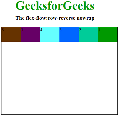
row-reverse nowrap: Nó sắp xếp hàng ngược lại với hướng văn bản và mặc định của wrap-flex là nowrap. Nó chỉ định rằng các item không được phép xuống hàng. Các item sẽ được hiển thị trên một dòng duy nhất.Cú pháp:
flex-flow: row-reverse nowrap;Ví dụ: html
<!DOCTYPE html>
<head>
    <title>flex-flow property</title>
    <style>
        #main {
            width: 400px;
            height: 300px;
            border: 2px solid black;
            display: flex;
            flex-flow: row-reverse nowrap;
        }

        #main div {
            width: 100px;
            height: 50px;
        }

        h1 {
            color: #009900;
            font-size: 42px;
            margin-left: 50px;
        }

        h3 {
            margin-top: -20px;
            margin-left: 50px;
        }
    </style>
</head>

<body>
    <h1>GeeksforGeeks</h1>
    <h3>The flex-flow:row-reverse nowrap</h3>
    <div id="main">
        <div style="background-color:#009900;">1</div>
        <div style="background-color:#00cc99;">2</div>
        <div style="background-color:#0066ff;">3</div>
        <div style="background-color:#66ffff;">4</div>
        <div style="background-color:#660066;">5</div>
        <div style="background-color:#663300;">6</div>
    </div>
</body>

</html>
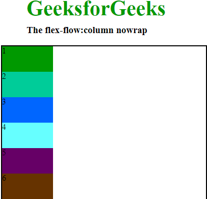
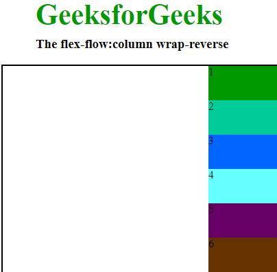
column nowrap: Tương tự như row nhưng từ trên xuống dưới và mặc định của wrap-flex là nowrap. Nó chỉ định item không được phép xuống hàng. Các item sẽ được hiển thị trên một dòng duy nhất.Cú pháp:
flex-flow: column nowrap;Ví dụ: html
<!DOCTYPE html>
<head>
    <title>flex-flow property</title>
    <style>
        #main {
            width: 400px;
            height: 300px;
            border: 2px solid black;
            display: flex;
            flex-flow: column nowrap;
        }

        #main div {
            width: 100px;
            height: 50px;
        }

        h1 {
            color: #009900;
            font-size: 42px;
            margin-left: 50px;
        }

        h3 {
            margin-top: -20px;
            margin-left: 50px;
        }
    </style>
</head>

<body>
    <h1>GeeksforGeeks</h1>
    <h3>The flex-flow:column nowrap</h3>
    <div id="main">
        <div style="background-color:#009900;">1</div>
        <div style="background-color:#00cc99;">2</div>
        <div style="background-color:#0066ff;">3</div>
        <div style="background-color:#66ffff;">4</div>
        <div style="background-color:#660066;">5</div>
        <div style="background-color:#663300;">6</div>
    </div>
</body>

</html>
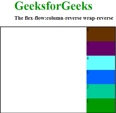
column-reverse nowrap: Tương tự như row-reverse nhưng từ trên xuống dưới và mặc định là nowrap. Nó chỉ định rằng các item không được phép xuống hàng. Các item sẽ được hiển thị trên một dòng duy nhất.Cú pháp:
flex-flow: column-reverse nowrap;Ví dụ: html
<!DOCTYPE html>
<head>
    <title>flex-flow property</title>
    <style>
        #main {
            width: 400px;
            height: 300px;
            border: 2px solid black;
            display: flex;
            flex-flow: column-reverse nowrap;
        }

        #main div {
            width: 100px;
            height: 50px;
        }

        h1 {
            color: #009900;
            font-size: 42px;
            margin-left: 50px;
        }

        h3 {
            margin-top: -20px;
            margin-left: 50px;
        }
    </style>
</head>

<body>
    <h1>GeeksforGeeks</h1>
    <h3>The flex-flow:column-reverse nowrap</h3>
    <div id="main">
        <div style="background-color:#009900;">1</div>
        <div style="background-color:#00cc99;">2</div>
        <div style="background-color:#0066ff;">3</div>
        <div style="background-color:#66ffff;">4</div>
        <div style="background-color:#660066;">5</div>
        <div style="background-color:#663300;">6</div>
    </div>
</body>

</html>

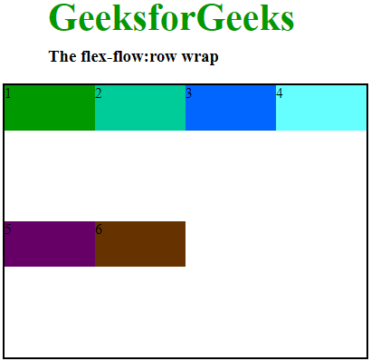
row wrap: Nó sắp xếp hàng theo hướng văn bản và thuộc tính wrap dùng để xuống hàng. Nó làm cho các flex item xuống nhiều hàng theo chiều rộng của item.Cú pháp:
flex-flow: row wrap;Ví dụ: html
<!DOCTYPE html>
<head>
    <title>flex-flow property</title>
    <style>
        #main {
            width: 400px;
            height: 300px;
            border: 2px solid black;
            display: flex;
            flex-flow: row wrap;
        }

        #main div {
            width: 100px;
            height: 50px;
        }

        h1 {
            color: #009900;
            font-size: 42px;
            margin-left: 50px;
        }

        h3 {
            margin-top: -20px;
            margin-left: 50px;
        }
    </style>
</head>

<body>
    <h1>GeeksforGeeks</h1>
    <h3>The flex-flow:row wrap</h3>
    <div id="main">
        <div style="background-color:#009900;">1</div>
        <div style="background-color:#00cc99;">2</div>
        <div style="background-color:#0066ff;">3</div>
        <div style="background-color:#66ffff;">4</div>
        <div style="background-color:#660066;">5</div>
        <div style="background-color:#663300;">6</div>
    </div>
</body>

</html>
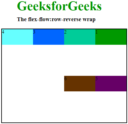
row-reverse wrap: Nó sắp xếp hàng ngược hướng văn bản và wrap đảo ngược thứ tự các item. Khi các item xuống hàng mới thứ tự của chúng sẽ đảo ngược.Cú pháp:
flex-flow: row-reverse wrap;Ví dụ: html
<!DOCTYPE html>
<head>
    <title>flex-flow property</title>
    <style>
        #main {
            width: 400px;
            height: 300px;
            border: 2px solid black;
            display: flex;
            flex-flow: row-reverse wrap;
        }

        #main div {
            width: 100px;
            height: 50px;
        }

        h1 {
            color: #009900;
            font-size: 42px;
            margin-left: 50px;
        }

        h3 {
            margin-top: -20px;
            margin-left: 50px;
        }
    </style>
</head>

<body>
    <h1>GeeksforGeeks</h1>
    <h3>The flex-flow:row-reverse wrap</h3>
    <div id="main">
        <div style="background-color:#009900;">1</div>
        <div style="background-color:#00cc99;">2</div>
        <div style="background-color:#0066ff;">3</div>
        <div style="background-color:#66ffff;">4</div>
        <div style="background-color:#660066;">5</div>
        <div style="background-color:#663300;">6</div>
    </div>
</body>

</html>
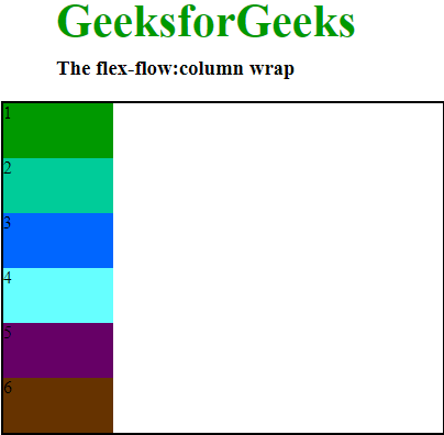
column wrap: Tương tự row nhưng từ trên xuống dưới và wrap đảo ngược thứ tự. Khi các item xuống hàng mới thứ tự của chúng sẽ đảo ngược.Cú pháp:
flex-flow:column wrap;Ví dụ: html
<!DOCTYPE html>
<head>
    <title>flex-flow property</title>
    <style>
        #main {
            width: 400px;
            height: 300px;
            border: 2px solid black;
            display: flex;
            flex-flow: column wrap;
        }

        #main div {
            width: 100px;
            height: 50px;
        }

        h1 {
            color: #009900;
            font-size: 42px;
            margin-left: 50px;
        }

        h3 {
            margin-top: -20px;
            margin-left: 50px;
        }
    </style>
</head>

<body>
    <h1>GeeksforGeeks</h1>
    <h3>The flex-flow:column wrap</h3>
    <div id="main">
        <div style="background-color:#009900;">1</div>
        <div style="background-color:#00cc99;">2</div>
        <div style="background-color:#0066ff;">3</div>
        <div style="background-color:#66ffff;">4</div>
        <div style="background-color:#660066;">5</div>
        <div style="background-color:#663300;">6</div>
    </div>
</body>

</html>
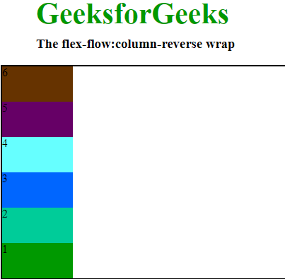
column-reverse wrap: Tương tự như row-reverse nhưng từ trên xuống dưới. Thuộc tính wrap được dùng để đảo ngược thứ tự các flex item. Khi chúng xuống hàng mới.Cú pháp:
flex-flow:column-reverse wrap;Ví dụ: html
<!DOCTYPE html>
<head>
    <title>flex-flow property</title>
    <style>
        #main {
            width: 400px;
            height: 300px;
            border: 2px solid black;
            display: flex;
            flex-flow: column-reverse wrap;
        }

        #main div {
            width: 100px;
            height: 50px;
        }

        h1 {
            color: #009900;
            font-size: 42px;
            margin-left: 50px;
        }

        h3 {
            margin-top: -20px;
            margin-left: 50px;
        }
    </style>
</head>

<body>
    <h1>GeeksforGeeks</h1>
    <h3>The flex-flow:column-reverse wrap</h3>
    <div id="main">
        <div style="background-color:#009900;">1</div>
        <div style="background-color:#00cc99;">2</div>
        <div style="background-color:#0066ff;">3</div>
        <div style="background-color:#66ffff;">4</div>
        <div style="background-color:#660066;">5</div>
        <div style="background-color:#663300;">6</div>
    </div>
</body>

</html>
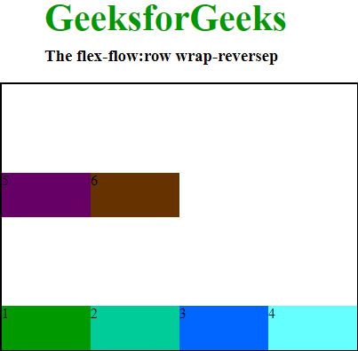
row wrap-reverse: Nó sắp xếp hàng theo hướng văn bản và thuộc tính wrap-reverse. Thuộc tính này đảo ngược thứ tự của các flex item khi xuống hàng mới.Cú pháp:
flex-flow:row wrap-reverse;Ví dụ: html
<!DOCTYPE html>
<html>
<head>
    <title>flex-flow property</title>
    <style>
        #main {
            width: 400px;
            height: 300px;
            border: 2px solid black;
            display: flex;
            flex-flow: row wrap-reverse;
        }

        #main div {
            width: 100px;
            height: 50px;
        }

        h1 {
            color: #009900;
            font-size: 42px;
            margin-left: 50px;
        }

        h3 {
            margin-top: -20px;
            margin-left: 50px;
        }
    </style>
</head>
<body>
    <h1>GeeksforGeeks</h1>
    <h3>The flex-flow: row wrap-reverse</h3>
    <div id="main">
        <div style="background-color:#009900;">1</div>
        <div style="background-color:#00cc99;">2</div>
        <div style="background-color:#0066ff;">3</div>
        <div style="background-color:#66ffff;">4</div>
        <div style="background-color:#660066;">5</div>
        <div style="background-color:#663300;">6</div>
    </div>
</body>
</html>
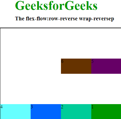
row-reverse wrap-reverse: Nó sắp xếp hàng ngược hướng văn bản và thuộc tính wrap-reverse. Thuộc tính này đảo ngược thứ tự của các flex item khi xuống hàng mới.Cú pháp:
flex-flow:row-reverse wrap-reverse;Ví dụ: html
<!DOCTYPE html>
<html lang="en">
<head>
    <meta charset="UTF-8">
    <meta name="viewport" content="width=device-width, initial-scale=1.0">
    <title>flex-flow property</title>
    <style>
        #main {
            width: 400px;
            height: 300px;
            border: 2px solid black;
            display: flex;
            flex-flow: row-reverse wrap-reverse;
        }
        #main div {
            width: 100px;
            height: 50px;
        }
        h1 {
            color: #009900;
            font-size: 42px;
            margin-left: 50px;
        }
        h3 {
            margin-top: -20px;
            margin-left: 50px;
        }
    </style>
</head>
<body>
    <h1>GeeksforGeeks</h1>
    <h3>The flex-flow: row-reverse wrap-reverse</h3>
    <div id="main">
        <div style="background-color:#009900;">1</div>
        <div style="background-color:#00cc99;">2</div>
        <div style="background-color:#0066ff;">3</div>
        <div style="background-color:#66ffff;">4</div>
        <div style="background-color:#660066;">5</div>
        <div style="background-color:#663300;">6</div>
    </div>
</body>
</html>
column wrap-reverse: Nó sắp xếp tương tự row nhưng từ trên xuống và thuộc tính wrap-reverse. Thuộc tính này đảo ngược thứ tự của các flex item khi xuống hàng mới.Cú pháp:
flex-flow:column wrap-reverse;Ví dụ: html
<!DOCTYPE html>
<html lang="en">
<head>
    <meta charset="UTF-8">
    <meta name="viewport" content="width=device-width, initial-scale=1.0">
    <title>flex-flow property</title>
    <style>
        #main {
            width: 400px;
            height: 300px;
            border: 2px solid black;
            display: flex;
            flex-flow: column wrap-reverse;
        }

        #main div {
            width: 100px;
            height: 50px;
        }

        h1 {
            color: #009900;
            font-size: 42px;
            margin-left: 50px;
        }

        h3 {
            margin-top: -20px;
            margin-left: 50px;
        }
    </style>
</head>
<body>
    <h1>GeeksforGeeks</h1>
    <h3>The flex-flow:column wrap-reverse</h3>
    <div id="main">
        <div style="background-color:#009900;">1</div>
        <div style="background-color:#00cc99;">2</div>
        <div style="background-color:#0066ff;">3</div>
        <div style="background-color:#66ffff;">4</div>
        <div style="background-color:#660066;">5</div>
        <div style="background-color:#663300;">6</div>
    </div>
</body>
</html>
column-reverse wrap-reverse: Nó sắp xếp tương tự row-reverse từ trên xuống dưới và thuộc tính wrap-reverse. Thuộc tính này đảo ngược thứ tự các flex item khi chúng xuống hàng.Cú pháp:
flex-flow:column-reverse wrap-reverse;Ví dụ: html
<!DOCTYPE html>

<head>
    <title>flex-flow property</title>
    <style>
        #main {
            width: 400px;
            height: 300px;
            border: 2px solid black;
            display: flex;
            flex-flow: column-reverse wrap-reverse;
        }

        #main div {
            width: 100px;
            height: 50px;
        }

        h1 {
            color: #009900;
            font-size: 42px;
            margin-left: 50px;
        }

        h3 {
            margin-top: -20px;
            margin-left: 50px;
        }
    </style>
</head>

<body>
    <h1>GeeksforGeeks</h1>
    <h3>The flex-flow:column-reverse wrap-reverse</h3>
    <div id="main">
        <div style="background-color:#009900;">1</div>
        <div style="background-color:#00cc99;">2</div>
        <div style="background-color:#0066ff;">3</div>
        <div style="background-color:#66ffff;">4</div>
        <div style="background-color:#660066;">5</div>
        <div style="background-color:#663300;">6</div>
    </div>
</body>

</html>
Các trình duyệt được hỗ trợ:
- Google Chrome 29.0
- Internet Explorer 11.0
- Mozila Firefox 28.0
- Safari 9.0
- Opera 17.0