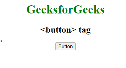
CSS buttons cải thiện giao diện trang web bằng cách áp dụng các thuộc tính kiểu dáng khác nhau. Chúng tạo điều kiện xử lý sự kiện, tương tác người dùng từ gửi biểu mẫu đến truy cập thông tin. HTML`<button>` tag được dùng để tạo các nút.
Example: Để minh họa việc triển khai nhiều chức năng nút với nhiều thuộc tính của nó.
HTML<!DOCTYPE html>
<html>
<head>
<title> HTML <button> tag</title>
<style>
body {
text-align: center;
}
h1 {
color: green;
text-align: center;
}
</style>
</head>
<body>
<h1>GeeksforGeeks</h1>
<h2><button> tag</h2>
<button>Button</button>
</body>
</html>
Output:
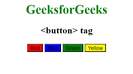
 Có rất nhiều thuộc tính CSS được sử dụng để tạo kiểu cho phần tử button. Chúng bao gồm các thuộc tính được liệt kê sau đây.
Background-colour property
Thuộc tính này được dùng để đặt background color của nút.
Syntax:
element {
     background-color: color_name;
}
Example: Để minh họa việc áp dụng màu nền cho nút bằng CSS.
HTML<!DOCTYPE html>
<html>
<head>
<title>HTML <button> tag </title>
<style>
body
{
text-align: center;
}
h1 {
color: green;
text-align: center;
}
.b1 {
background-color: red;
}
.b2 {
background-color: blue;
}
.b3 {
background-color: green;
}
.b4 {
background-color: yellow;
}
</style>
</head>
<body>
<h1>GeeksforGeeks</h1>
<h2><button> tag</h2>
<div class="btn">
<button class="button b1">Red</button>
<button class="button b2">Blue</button>
<button class="button b3">Green</button>
<button class="button b4">Yellow</button>
</div>
</body>
</html>
Output:
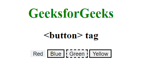
Border property
Thuộc tính này được dùng để đặt border cho nút.
Syntax:
element {
      border: style;
}
Example: Để minh họa việc áp dụng thuộc tính border cho Button bằng CSS.
HTML<!DOCTYPE html>
<html>
<head>
<title>HTML <button> tag</title>
<style>
body {
text-align: center;
}
h1 {
color: green;
text-align: center;
}
.b1 {
border: none;
}
.b2 {
border: 2px black solid;
}
.b3 {
border: 2px black dashed;
}
.b4 {
border: 2px black double;
}
</style>
</head>
<body>
<h1>GeeksforGeeks</h1>
<h2><button> tag</h2>
<div class="btn">
<button class="button b1">Red</button>
<button class="button b2">Blue</button>
<button class="button b3">Green</button>
<button class="button b4">Yellow</button>
</div>
</body>
</html>
Output:
Color property
Thuộc tính này được dùng để đặt color cho chữ trong nút. Giá trị color có thể được đặt theo tên màu, mã hex màu.
Syntax:
element {
     color: style;
}
Example: Để minh họa việc áp dụng thuộc tính color cho Button bằng CSS.
HTML<!DOCTYPE html>
<html>
<head>
<title>HTML <button> tag </title>
<style>
h1 {
color: green;
}
.button {
border: none;
color: white;
border-radius: 8px;
text-align: center;
padding: 20px;
cursor: pointer;
font-size: 20px;
}
.b1 {
color: white;
}
.b2 {
color: black;
}
.b3 {
color: blue;
}
.b4 {
color: crimson;
}
</style>
</head>
<body>
<h1>GeeksforGeeks</h1>
<h2>HTML <button> tag</h2>
<div class="btn">
<button class="button b1">Red</button>
<button class="button b2">Blue</button>
<button class="button b3">Green</button>
<button class="button b4">Yellow</button>
</div>
</body>
</html>
Output:
Padding property
Thuộc tính padding được dùng để đặt khoảng đệm (padding) trong nút.
Syntax:
element {
     padding: style;
}
Example: Để minh họa việc áp dụng thuộc tính padding cho Button trong CSS.
HTML<!DOCTYPE html>
<html>
<head>
<title>HTML button tag </title>
<style>
h1 {
color: green;
text-align: center;
}
.button {
border: none;
color: white;
border-radius: 8px;
text-align: center;
padding: 20px;
cursor: pointer;
font-size: 20px;
}
.b1 {
background-color: red;
padding: 15px 32px;
}
.b2 {
background-color: blue;
padding: 24px 50px;
}
.b3 {
background-color: green;
padding: 32px 32px;
}
.b4 {
background-color: yellow;
padding: 16px;
}
</style>
</head>
<body>
<h1>GeeksforGeeks</h1>
<h2>HTML <button> tag</h2>
<div class="btn">
<button class="button b1">Red</button>
<button class="button b2">Blue</button>
<button class="button b3">Green</button>
<button class="button b4">Yellow</button>
</div>
</body>
</html>
Output:
Font-size property
Thuộc tính này được dùng để đặt font size cho chữ trong nút. Thay đổi giá trị pixel để có được kích thước mong muốn.
Syntax:
element {
     font-size: style;
}
Example: Để minh họa việc triển khai thuộc tính font-size để điều chỉnh font của Button trong CSS.
HTML<!DOCTYPE html>
<html>
<head>
<title>HTML button tag </title>
<style>
h1 {
text-align: center;
}
.button {
border: none;
color: white;
border-radius: 8px;
text-align: center;
padding: 20px;
cursor: pointer;
font-size: 20px;
}
.b1 {
background-color: red;
font-size: 10px;
}
.b2 {
background-color: blue;
font-size: 15px;
}
.b3 {
background-color: green;
font-size: 20px;
}
.b4 {
background-color: yellow;
font-size: 30px;
}
</style>
</head>
<body>
<h1>GeeksforGeeks</h1>
<h2>HTML <button> tag</h2>
<div class="btn">
<button class="button b1">Red</button>
<button class="button b2">Blue</button>
<button class="button b3">Green</button>
<button class="button b4">Yellow</button>
</div>
</body>
</html>
Output:
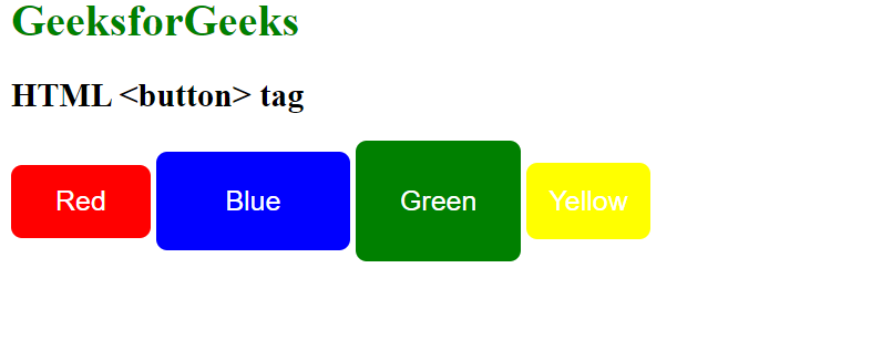
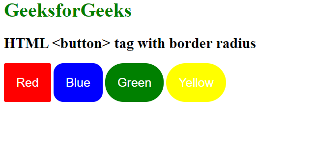
Border-radius property
Thuộc tính này được dùng để đặt border-radius của nút. Nó đặt các góc tròn của border.
Syntax:
element {
     border-radius: property;
}
Example: Để minh họa việc áp dụng thuộc tính border-radius cho Button trong CSS.
HTML<!DOCTYPE html>
<html>
<head>
<title>HTML button tag </title>
<style>
h1 {
color: green;
}
.button {
border: none;
color: white;
border-radius: 8px;
text-align: center;
padding: 20px;
cursor: pointer;
font-size: 20px;
}
.b1 {
background-color: red;
border-radius: 3px;
}
.b2 {
background-color: blue;
border-radius: 16px;
}
.b3 {
background-color: green;
border-radius: 30px;
}
.b4 {
background-color: yellow;
border-radius: 70px;
}
</style>
</head>
<body>
<h1>GeeksforGeeks</h1>
<h2>HTML <button> tag with border radius</h2>
<div class="btn">
<button class="button b1">Red</button>
<button class="button b2">Blue</button>
<button class="button b3">Green</button>
<button class="button b4">Yellow</button>
</div>
</body>
</html>
Output:
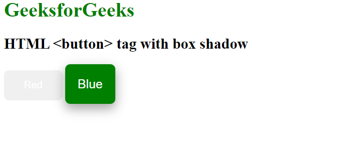
Box-shadow property
Thuộc tính box-shadow được dùng để tạo bóng cho hộp nút.
Syntax:
box-shadow: [horizontal offset] [vertical offset] [blur radius]
            [optional spread radius] [color];
Example: Để minh họa việc áp dụng thuộc tính box-shadow cho Button trong CSS.
HTML<!DOCTYPE html>
<html>
<head>
<title>HTML button tag </title>
<style>
h1 {
color: green;
}
.button {
border: none;
color: white;
border-radius: 8px;
text-align: center;
padding: 20px;
cursor: pointer;
font-size: 20px;
}
.b1 {
padding: 15px 32px;
border: none;
font-size: 16px;
color: white;
}
.b2 {
background-color: green;
box-shadow: 0 8px 16px 0 rgba(0, 0, 0, 0.2),
0 6px 20px 0 rgba(0, 0, 0, 0.19);
}
</style>
</head>
<body>
<h1>GeeksforGeeks</h1>
<h2>HTML <button> tag with box shadow</h2>
<div class="btn">
<button class="button b1">Red</button>
<button class="button b2">Blue</button>
</div>
</body>
</html>
Output:
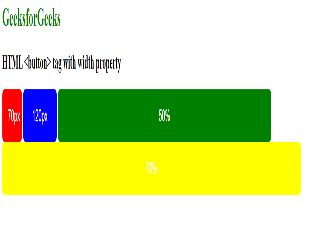
Width property
Thuộc tính width được dùng để đặt width của nút.
Syntax:
element {
     width: property;
}
Example: Để minh họa việc triển khai thuộc tính width để đặt chiều rộng của Button trong CSS.
HTML<!DOCTYPE html>
<html>
<head>
<title> button tag </title>
<style>
h1 {
color: green;
}
.button {
border: none;
color: white;
border-radius: 8px;
text-align: center;
padding: 20px;
cursor: pointer;
font-size: 20px;
}
/* adding width in buttons */
.b1 {
background-color: red;
width: 70px;
}
.b2 {
background-color: blue;
width: 120px;
}
.b3 {
background-color: green;
width: 50%;
}
.b4 {
background-color: yellow;
width: 70%;
}
</style>
</head>
<body>
<h1>GeeksforGeeks</h1>
<h2>HTML <button> tag with width property</h2>
<div class="btn">
<button class="button b1">Red</button>
<button class="button b2">Blue</button>
<button class="button b3">Green</button>
<button class="button b4">Yellow</button>
</div>
</body>
</html>
Output:
Hover Effects property
Thuộc tính hover được dùng để thay đổi giao diện nút khi di chuột qua.
Syntax:
element:hover {
    // CSS property
}
Example: Để minh họa việc triển khai hiệu ứng di chuột trên nút bằng thuộc tính hover trong CSS.
HTML<!DOCTYPE html>
<html>
<head>
<title>HTML button tag </title>
<style>
h1 {
color: green;
}
.button {
border: none;
color: white;
border-radius: 8px;
text-align: center;
padding: 20px;
cursor: pointer;
font-size: 20px;
}
.b1 {
background-color: green;
}
.b2 {
background-color: orange;
}
.b1:hover {
background-color: white;
color: orange;
}
.b2:hover {
background-color: white;
color: green;
}
</style>
</head>
<body>
<h1>GeeksforGeeks</h1>
<h2>HTML <button> tag with hover</h2>
<div class="btn">
<button class="button b1">Red</button>
<button class="button b2">Blue</button>
</div>
</body>
</html>
Output:
Animated , Disabled, Fade in effects
- Animated Button: Làm cho việc nhấp vào nút thú vị hơn bằng cách thêm một hoạt ảnh nhẹ nhàng.
- Disabled Button: Cho biết một nút tạm thời không hoạt động, hoặc hành động của nó hiện không khả dụng.
- Fade-in Effect on Hover: Nút thay đổi màu sắc mượt mà khi bạn di chuột qua nó, làm cho nó trông bóng bẩy và nhạy bén.
Example: Để minh họa việc triển khai các hiệu ứng hoạt hình, vô hiệu hóa và làm mờ khi di chuột trong CSS.
HTML<!DOCTYPE html>
<html>
<head>
<title>HTML button tag</title>
<style>
h1 {
color: green;
}
button {
margin-top: 15px;
padding: 10px;
display: block;
cursor: pointer;
transition: background-color 0.3s, color 0.3s;
}
/* Disabled button styling */
button:disabled {
opacity: 0.5;
cursor: not-allowed;
}
/* Animated button styling */
button.animated {
animation: pulse 1s infinite;
}
@keyframes pulse {
0% {
transform: scale(1);
}
50% {
transform: scale(1.1);
}
100% {
transform: scale(1);
}
}
/* Fade-in effect on hover */
button:hover {
background-color: #2ecc71;
color: #fff;
}
</style>
</head>
<body>
<h1>GeeksforGeeks</h1>
<h2>HTML <button> tag</h2>
<!-- Button with additional styles -->
<button>Button</button>
<!-- Disabled button -->
<button disabled>
Disabled Button
</button>
<!-- Animated button -->
<button class="animated">
Animated Button
</button>
</body>
</html>
Output:
Supported Browsers:
- Google Chrome
- Firefox
- Microsoft Edge
- Opera
- Safari