Thuộc tính CSS backdrop-filter được dùng để áp dụng hiệu ứng cho vùng phía sau một phần tử. Khác với thuộc tính filter áp dụng hiệu ứng lên toàn bộ phần tử. Nó giúp bạn không cần thêm phần tử chỉ để tạo kiểu cho background.
Cú pháp:
backdrop-filter: blur() | brightness() | contrast() | drop-shadow() | grayscale() | hue-rotate() | invert() | opacity() | saturate() | sepia() | none | initial | inherit
Giá trị thuộc tính:
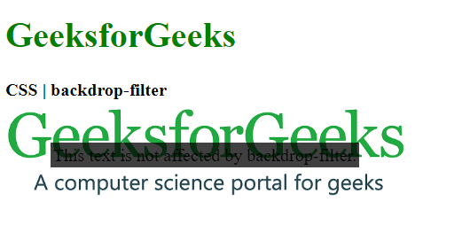
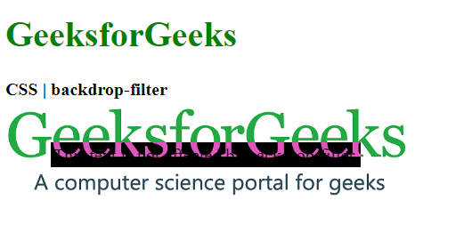
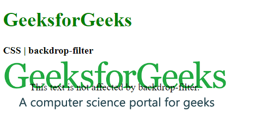
- blur(): Dùng để làm mờ ảnh theo hiệu ứng Gaussian blur. Giá trị mặc định là 0 tức là không áp dụng hiệu ứng mờ.
Ví dụ:
html<!DOCTYPE html>
<html>
<head>
<title>CSS | backdrop-filter</title>
<style>
.container {
background-image: url(
"https://media.geeksforgeeks.org/wp-content/uploads/geeksforgeeks-25.png");
background-size: cover;
display: flex;
align-items: center;
justify-content: center;
height: 100px;
width: 360px;
}
.foreground {
backdrop-filter: blur(5px);
padding: 2px;
}
</style>
</head>
<body>
<h1 style="color: green">
GeeksforGeeks
</h1>
<b>CSS | backdrop-filter</b>
<div class="container">
<div class="foreground">
This text is not affected
by backdrop-filter.
</div>
</div>
</body>
</html>
- Đầu ra:

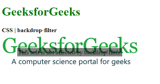
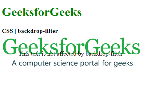
- brightness(): Làm ảnh sáng hơn hoặc tối hơn. Giá trị lớn hơn 100% làm sáng ảnh. Giá trị nhỏ hơn 100% làm tối ảnh. Nếu độ sáng là 0% ảnh sẽ hoàn toàn đen.
Ví dụ:
html<!DOCTYPE html>
<html>
<head>
<title>CSS | backdrop-filter</title>
<style>
.container {
background-image: url(
"https://media.geeksforgeeks.org/wp-content/uploads/geeksforgeeks-25.png");
background-size: cover;
display: flex;
align-items: center;
justify-content: center;
height: 100px;
width: 360px;
}
.foreground {
backdrop-filter: brightness(25%);
padding: 2px;
}
</style>
</head>
<body>
<h1 style="color: green">
GeeksforGeeks
</h1>
<b>CSS | backdrop-filter</b>
<div class="container">
<div class="foreground">
This text is not affected
by backdrop-filter.
</div>
</div>
</body>
</html>
- Đầu ra:
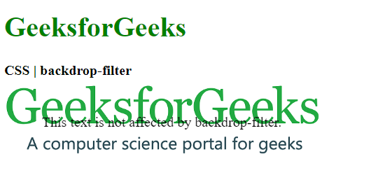
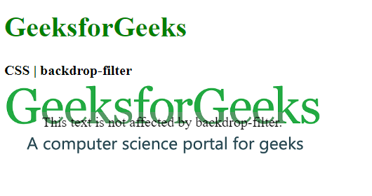
- contrast(): Dùng để thiết lập độ tương phản của ảnh. Ảnh gốc có độ tương phản là 100%. Nếu độ tương phản dưới 0% ảnh sẽ hoàn toàn đen.
Ví dụ:
html<!DOCTYPE html>
<html>
<head>
<title>CSS | backdrop-filter</title>
<style>
.container {
background-image: url(
"https://media.geeksforgeeks.org/wp-content/uploads/geeksforgeeks-25.png");
background-size: cover;
display: flex;
align-items: center;
justify-content: center;
height: 100px;
width: 360px;
}
.foreground {
backdrop-filter: contrast(20%);
padding: 2px;
}
</style>
</head>
<body>
<h1 style="color: green">
GeeksforGeeks
</h1>
<b>CSS | backdrop-filter</b>
<div class="container">
<div class="foreground">
This text is not affected by
backdrop-filter.
</div>
</div>
</body>
</html>
- Đầu ra:

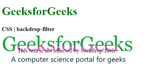
- drop-shadow(): Dùng để thêm hiệu ứng đổ bóng cho phần tử. Chấp nhận các giá trị bóng ngang dọc cùng với độ lan tỏa và màu sắc.
Ví dụ:
html<!DOCTYPE html>
<html>
<head>
<title>CSS | backdrop-filter</title>
<style>
.container {
background-image: url(
"https://media.geeksforgeeks.org/wp-content/uploads/geeksforgeeks-25.png");
background-size: cover;
display: flex;
align-items: center;
justify-content: center;
height: 100px;
width: 360px;
}
.foreground {
backdrop-filter: drop-shadow(20px 10px red);
padding: 2px;
}
</style>
</head>
<body>
<h1 style="color: green">
GeeksforGeeks
</h1>
<b>CSS | backdrop-filter</b>
<div class="container">
<div class="foreground">
This text is not affected by
backdrop-filter.
</div>
</div>
</body>
</html>
- Đầu ra:
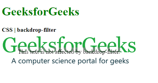
- grayscale(): Chuyển màu sắc của ảnh thành đen trắng. Giá trị 0% là ảnh gốc. Giá trị 100% là ảnh đen trắng hoàn toàn.
Ví dụ:
html<!DOCTYPE html>
<html>
<head>
<title>CSS | backdrop-filter</title>
<style>
.container {
background-image: url(
"https://media.geeksforgeeks.org/wp-content/uploads/geeksforgeeks-25.png");
background-size: cover;
display: flex;
align-items: center;
justify-content: center;
height: 100px;
width: 360px;
}
.foreground {
backdrop-filter: grayscale(75%);
padding: 2px;
}
</style>
</head>
<body>
<h1 style="color: green">
GeeksforGeeks
</h1>
<b>CSS | backdrop-filter</b>
<div class="container">
<div class="foreground">
This text is not affected by
backdrop-filter.
</div>
</div>
</body>
</html>
- Đầu ra:
- hue-rotate(): Áp dụng xoay màu sắc cho ảnh. Giá trị là số độ trên vòng tròn màu mà ảnh sẽ được điều chỉnh. Giá trị mặc định là 0 đại diện cho ảnh gốc.
Ví dụ:
html<!DOCTYPE html>
<html>
<head>
<title>CSS | backdrop-filter</title>
<style>
.container {
background-image: url(
"https://media.geeksforgeeks.org/wp-content/uploads/geeksforgeeks-25.png");
background-size: cover;
display: flex;
align-items: center;
justify-content: center;
height: 100px;
width: 360px;
}
.foreground {
backdrop-filter: hue-rotate(180deg);
padding: 2px;
}
</style>
</head>
<body>
<h1 style="color: green">
GeeksforGeeks
</h1>
<b>CSS | backdrop-filter</b>
<div class="container">
<div class="foreground">
This text is not affected by
backdrop-filter.
</div>
</div>
</body>
</html>
- Đầu ra:
- invert(): Đảo ngược màu sắc của ảnh. Giá trị mặc định là 0% là ảnh gốc. Giá trị 100% sẽ đảo ngược hoàn toàn màu sắc.
Ví dụ:
html<!DOCTYPE html>
<html>
<head>
<title>CSS | backdrop-filter</title>
<style>
.container {
background-image: url(
"https://media.geeksforgeeks.org/wp-content/uploads/geeksforgeeks-25.png");
background-size: cover;
display: flex;
align-items: center;
justify-content: center;
height: 100px;
width: 360px;
}
.foreground {
backdrop-filter: invert(100%);
padding: 2px;
}
</style>
</head>
<body>
<h1 style="color: green">
GeeksforGeeks
</h1>
<b>CSS | backdrop-filter</b>
<div class="container">
<div class="foreground">
This text is not affected by
backdrop-filter.
</div>
</div>
</body>
</html>
- Đầu ra:
- opacity(): Thiết lập độ trong suốt của ảnh. Giá trị mặc định là 0% ảnh hoàn toàn trong suốt. Giá trị 100% ảnh hoàn toàn không trong suốt.
Ví dụ:
html<!DOCTYPE html>
<html>
<head>
<title>CSS | backdrop-filter</title>
<style>
.container {
background-image: url(
"https://media.geeksforgeeks.org/wp-content/uploads/geeksforgeeks-25.png");
background-size: cover;
display: flex;
align-items: center;
justify-content: center;
height: 100px;
width: 360px;
}
.foreground {
backdrop-filter: opacity(50%);
padding: 2px;
}
</style>
</head>
<body>
<h1 style="color: green">
GeeksforGeeks
</h1>
<b>CSS | backdrop-filter</b>
<div class="container">
<div class="foreground">
This text is not affected by
backdrop-filter.
</div>
</div>
</body>
</html>
- Đầu ra:
- saturate(): Thiết lập độ bão hòa của phần tử. Giá trị mặc định là 100% là ảnh gốc. Giá trị 0% ảnh hoàn toàn không bão hòa. Giá trị lớn hơn 100% ảnh siêu bão hòa.
Ví dụ:
html<!DOCTYPE html>
<html>
<head>
<title>CSS | backdrop-filter</title>
<style>
.container {
background-image: url(
"https://media.geeksforgeeks.org/wp-content/uploads/geeksforgeeks-25.png");
background-size: cover;
display: flex;
align-items: center;
justify-content: center;
height: 100px;
width: 360px;
}
.foreground {
backdrop-filter: saturate(50%);
padding: 2px;
}
</style>
</head>
<body>
<h1 style="color: green">
GeeksforGeeks
</h1>
<b>CSS | backdrop-filter</b>
<div class="container">
<div class="foreground">
This text is not affected by
backdrop-filter.
</div>
</div>
</body>
</html>
- Đầu ra:
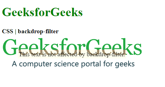
- sepia(): Chuyển ảnh sang màu sepia tạo vẻ ấm áp hơn. Giá trị 0% là ảnh gốc còn 100% là ảnh sepia hoàn toàn.
Ví dụ:
html<!DOCTYPE html>
<html>
<head>
<title>CSS | backdrop-filter</title>
<style>
.container {
background-image: url(
"https://media.geeksforgeeks.org/wp-content/uploads/geeksforgeeks-25.png");
background-size: cover;
display: flex;
align-items: center;
justify-content: center;
height: 100px;
width: 360px;
}
.foreground {
backdrop-filter: sepia(100%);
padding: 2px;
}
</style>
</head>
<body>
<h1 style="color: green">
GeeksforGeeks
</h1>
<b>CSS | backdrop-filter</b>
<div class="container">
<div class="foreground">
This text is not affected by
backdrop-filter.
</div>
</div>
</body>
</html>
- Đầu ra:
- none: Giá trị mặc định không áp dụng hiệu ứng nào cho ảnh.
Ví dụ:
html<!DOCTYPE html>
<html>
<head>
<title>CSS | backdrop-filter</title>
<style>
.container {
background-image: url(
"https://media.geeksforgeeks.org/wp-content/uploads/geeksforgeeks-25.png");
background-size: cover;
display: flex;
align-items: center;
justify-content: center;
height: 100px;
width: 360px;
}
.foreground {
backdrop-filter: none;
padding: 2px;
}
</style>
</head>
<body>
<h1 style="color: green">
GeeksforGeeks
</h1>
<b>CSS | backdrop-filter</b>
<div class="container">
<div class="foreground">
This text is not affected by
backdrop-filter.
</div>
</div>
</body>
</html>
- Đầu ra:
- initial: Dùng để thiết lập thuộc tính này về giá trị mặc định của nó.
Ví dụ:
html<!DOCTYPE html>
<html>
<head>
<title>CSS | backdrop-filter</title>
<style>
.container {
background-image: url(
"https://media.geeksforgeeks.org/wp-content/uploads/geeksforgeeks-25.png");
background-size: cover;
display: flex;
align-items: center;
justify-content: center;
height: 100px;
width: 360px;
}
.foreground {
backdrop-filter: initial;
padding: 2px;
}
</style>
</head>
<body>
<h1 style="color: green">
GeeksforGeeks
</h1>
<b>CSS | backdrop-filter</b>
<div class="container">
<div class="foreground">
This text is not affected by
backdrop-filter.
</div>
</div>
</body>
</html>
- Đầu ra:
- inherit: Kế thừa thuộc tính từ phần tử cha của nó.
Trình duyệt được hỗ trợ: Các trình duyệt hỗ trợ thuộc tính backdrop-filter được liệt kê dưới đây:
- Google Chrome 76.0 trở lên
- Edge 17.0 trở lên
- Firefox 103.0 trở lên
- Safari 9.0 trở lên
- Opera 63.0 trở lên