Trong CSS, align-self property dùng để căn chỉnh các phần tử đã chọn trong vùng chứa linh hoạt. Có nhiều kiểu căn chỉnh khác nhau như flex-end, center, flex-start...
Cú pháp:
align-self: auto|normal|self-start|self-end|stretch|center
    |baseline, first baseline, last baseline|flex-start
    |flex-end|baseline|safe|unsafe;
Giá trị thuộc tính: auto: Thuộc tính này kế thừa giá trị align-items từ vùng chứa cha. Nếu không có vùng chứa cha, nó sẽ kéo giãn phần tử. Đây là giá trị mặc định.
Cú pháp:
align-self: auto;
Ví dụ:
html<!DOCTYPE html>
<html>
<head>
<title>
CSS | align-self Property
</title>
<style>
#geeks {
width: 250px;
height: 200px;
border: 4px solid black;
display: -webkit-flex;
-webkit-align-items: flex-start;
display: flex;
align-items: flex-start;
}
#geeks div {
-webkit-flex: 2;
flex: 1;
}
#sudo {
-webkit-align-self: auto;
align-self: auto;
}
</style>
</head>
<body>
<center>
<h2 style="color:green;">
GeeksForGeeks
</h2>
<h3 style="color:green;">
align-self:auto;
</h3>
<div id="geeks">
<div style="background-color:green;color:white;">
Geeks
</div>
<div style="background-color:lightblue;"
id="sudo">
For
</div>
<div style="background-color:coral;">
Geeks
</div>
<div style="background-color:lightblue;">
Sudo
</div>
<div style="background-color:tomato;">
Placement
</div>
</div>
</center>
</body>
</html>
Đầu ra:
Vị trí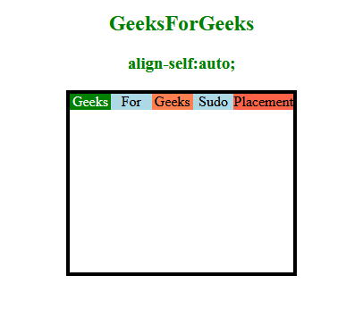
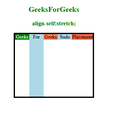
stretch: Thuộc tính này được dùng để định vị các phần tử vừa với vùng chứa.
Cú pháp:
align-self: stretch;
Ví dụ:
html<!DOCTYPE html>
<html>
<head>
<title>
CSS | align-self Property
</title>
<style>
#geeks {
width: 250px;
height: 200px;
border: 4px solid black;
display: -webkit-flex;
-webkit-align-items: flex-start;
display: flex;
align-items: flex-start;
}
#geeks div {
-webkit-flex: 2;
flex: 1;
}
#sudo {
-webkit-align-self: stretch;
align-self: stretch;
}
</style>
</head>
<body>
<center>
<h2 style="color:green;">
GeeksForGeeks
</h2>
<h3 style="color:green;">
align-self:stretch;
</h3>
<div id="geeks">
<div style="background-color:green;color:white;">
Geeks</div>
<div style="background-color:lightblue;"
id="sudo">
For
</div>
<div style="background-color:coral;">
Geeks
</div>
<div style="background-color:lightblue;">
Sudo
</div>
<div style="background-color:tomato;">
Placement
</div>
</div>
</center>
</body>
</html>
Đầu ra:
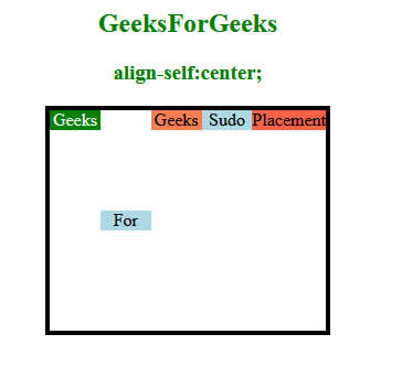
Center: Thuộc tính này dùng để đặt phần tử vào giữa vùng chứa linh hoạt.
Cú pháp:
align-self: center;
Ví dụ:
html<!DOCTYPE html>
<html>
<head>
<title>
CSS | align-self Property
</title>
<style>
#geeks {
width: 250px;
height: 200px;
border: 4px solid black;
display: -webkit-flex;
-webkit-align-items: flex-start;
display: flex;
align-items: flex-start;
}
#geeks div {
-webkit-flex: 1;
flex: 1;
}
#sudo {
-webkit-align-self: center;
align-self: center;
}
</style>
</head>
<body>
<center>
<h2 style="color:green;">
GeeksForGeeks
</h2>
<h3 style="color:green;">
align-self:center;
</h3>
<div id="geeks">
<div style="background-color:green;color:white;">
Geeks
</div>
<div style="background-color:lightblue;"
id="sudo">
For
</div>
<div style="background-color:coral;">
Geeks
</div>
<div style="background-color:lightblue;">
Sudo
</div>
<div style="background-color:tomato;">
Placement
</div>
</div>
</center>
</body>
</html>
Đầu ra:
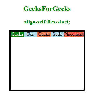
Cú pháp:
align-self: flex-start;
Ví dụ:
html<!DOCTYPE html>
<html>
<head>
<title>
CSS | align-self Property
</title>
<style>
#geeks {
width: 250px;
height: 200px;
border: 4px solid black;
display: -webkit-flex;
-webkit-align-items: flex-start;
display: flex;
align-items: flex-start;
}
#geeks div {
-webkit-flex: 1;
flex: 1;
}
#sudo {
-webkit-align-self: flex-start;
align-self: flex-start;
}
</style>
</head>
<body>
<center>
<h2 style="color:green;">
GeeksForGeeks
</h2>
<h3 style="color:green;">
align-self:flex-start;
</h3>
<div id="geeks">
<div style="background-color:green;color:white;">
Geeks
</div>
<div style="background-color:lightblue;"
id="sudo">
For
</div>
<div style="background-color:coral;">
Geeks
</div>
<div style="background-color:lightblue;">
Sudo
</div>
<div style="background-color:tomato;">
Placement
</div>
</div>
</center>
</body>
</html>
Đầu ra:
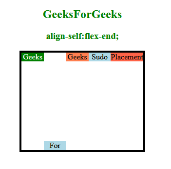
flex-end: Thuộc tính này dùng để đặt phần tử đã chọn ở cuối vùng chứa linh hoạt.
Cú pháp:
align-self: flex-end;
Ví dụ:
html<!DOCTYPE html>
<html>
<head>
<title>
CSS | align-self Property
</title>
<style>
#geeks {
width: 250px;
height: 200px;
border: 4px solid black;
display: -webkit-flex;
-webkit-align-items: flex-start;
display: flex;
align-items: flex-start;
}
#geeks div {
-webkit-flex: 1;
flex: 1;
}
#sudo {
-webkit-align-self: flex-end;
align-self: flex-end;
}
</style>
</head>
<body>
<center>
<h2 style="color:green;">
GeeksForGeeks
</h2>
<h3 style="color:green;">
align-self:flex-end;
</h3>
<div id="geeks">
<div style="background-color:green;color:white;">
Geeks
</div>
<div style="background-color:lightblue;"
id="sudo">
For
</div>
<div style="background-color:coral;">
Geeks
</div>
<div style="background-color:lightblue;">
Sudo
</div>
<div style="background-color:tomato;">
Placement
</div>
</div>
</center>
</body>
</html>
Đầu ra:
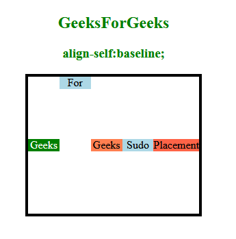
Baseline: Phần tử được đặt ở đường cơ sở của vùng chứa linh hoạt.
Cú pháp:
align-self: baseline;
Ví dụ:
html<!DOCTYPE html>
<html>
<head>
<title>
CSS | align-self Property
</title>
<style>
#geeks {
width: 250px;
height: 200px;
border: 4px solid black;
display: -webkit-flex;
/* Safari */
-webkit-align-items: center;
/* Safari 7.0+ */
display: flex;
align-items: center;
}
#geeks div {
-webkit-flex: 1;
/* Safari 6.1+ */
flex: 1;
}
#sudo {
-webkit-align-self: baseline;
/* Safari 7.0+ */
align-self: baseline;
}
</style>
</head>
<body>
<center>
<h2 style="color:green;">
GeeksForGeeks
</h2>
<h3 style="color:green;">
align-self:baseline;
</h3>
<div id="geeks">
<div style="background-color:green;color:white;">
Geeks
</div>
<div style="background-color:lightblue;"
id="sudo">
For
</div>
<div style="background-color:coral;">
Geeks
</div>
<div style="background-color:lightblue;">
Sudo
</div>
<div style="background-color:tomato;">
Placement
</div>
</div>
</center>
</body>
</html>
Đầu ra:
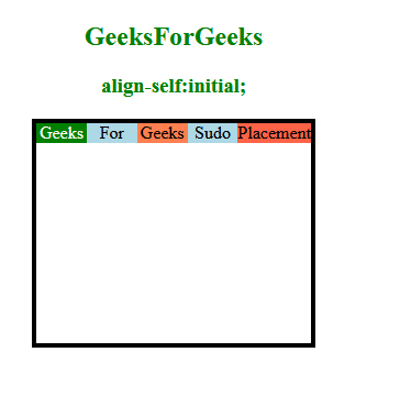
initial: Nó đặt thuộc tính về vị trí bình thường. Đây là giá trị mặc định.
Cú pháp:
align-self: initial;
Ví dụ:
html<!DOCTYPE html>
<html>
<head>
<title>
CSS | align-self Property
</title>
<style>
#geeks {
width: 250px;
height: 200px;
border: 4px solid black;
display: -webkit-flex;
/* Safari */
-webkit-align-items: flex-start;
/* Safari 7.0+ */
display: flex;
align-items: flex-start;
}
#geeks div {
-webkit-flex: 1;
/* Safari 6.1+ */
flex: 1;
}
#sudo {
-webkit-align-self: initial;
/* Safari 7.0+ */
align-self: initial;
}
</style>
</head>
<body>
<center>
<h2 style="color:green;">
GeeksForGeeks
</h2>
<h3 style="color:green;">
align-self:initial;
</h3>
<div id="geeks">
<div style="background-color:green;color:white;">
Geeks
</div>
<div style="background-color:lightblue;"
id="sudo">
For
</div>
<div style="background-color:coral;">
Geeks
</div>
<div style="background-color:lightblue;">
Sudo
</div>
<div style="background-color:tomato;">
Placement
</div>
</div>
</center>
</body>
</html>
Đầu ra:
Trình duyệt được hỗ trợ: Các trình duyệt hỗ trợ CSS | align-self Property được liệt kê dưới đây:
- Google Chrome
- Edge
- Firefox
- Opera
- Safari