A transformation trong CSS dùng để thay đổi hình dạng, kích thước, vị trí phần tử. Nó biến đổi các phần tử dọc theo trục X và trục Y. Có 6 loại transformation chính như sau:
- translate()
- rotate()
- scale()
- skewX()
- skewY()
- matrix()
Chúng ta sẽ triển khai tất cả các hàm này. Đồng thời tìm hiểu các khái niệm thông qua các ví dụ minh họa.
translate() Method:
Phương thức translate() được sử dụng để di chuyển phần tử từ vị trí thực tế. Việc di chuyển được thực hiện dọc theo trục X và trục Y.
Example: Ví dụ này mô tả phương thức translate() trong CSS. Nó dùng để thay đổi vị trí của một phần tử so với vị trí ban đầu.
<!DOCTYPE html>
<html>

<head>
    <title>2D Transform</title>
    <style>
    .geeks {
        font-size: 25px;
        margin: 20px 0;
        margin-left: 100px;
    }

    img {
        border: 1px solid black;
        transition-duration: 2s;
        -webkit-transition-duration: 2s;
    }

    img:hover {
        transform: translate(100px, 100px);

        /* prefix for IE 9 */
        -ms-transform: translate(100px, 100px);

        /* prefix for Safari and Chrome */
        -webkit-transform: translate(100px, 100px);
    }
    </style>
</head>

<body>
    <div class="geeks">Translate() Method</div>
        <img src=
"https://media.geeksforgeeks.org/wp-content/uploads/geeksforgeeks-9.png"
             alt="GFG" />
</body>

</html>
Output:
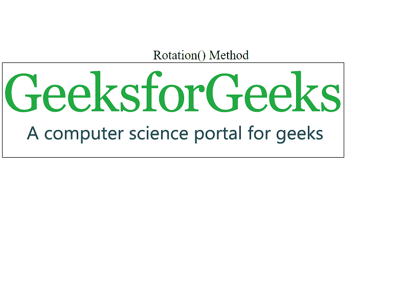
rotate() Method:
Phương thức rotate() xoay một phần tử theo chiều kim đồng hồ hoặc ngược chiều kim đồng hồ. Góc xoay được xác định bằng một giá trị độ (degree).
Example: Ví dụ này mô tả phương thức rotate() trong CSS. Phương thức này dùng để xoay một phần tử theo chiều kim đồng hồ hoặc ngược lại.
<!DOCTYPE html>
<html>

<head>
    <title>2D Transform</title>
    <style>
    img {
        border: 1px solid black;
    }

    img:hover {

        /* IE 9 */
        -ms-transform: rotate(20deg);

        /* Safari */
        -webkit-transform: rotate(20deg);

        /* Standard syntax */
        transform: rotate(20deg);
    }

    .geeks {
        font-size: 25px;
        text-align: center;
        margin-top: 100px;
    }
    </style>
</head>

<body>
    <div class="geeks">Rotation() Method</div>
        <img src=
"https://media.geeksforgeeks.org/wp-content/uploads/geeksforgeeks-9.png"
             alt="GFG" />
</body>

</html>
Output:
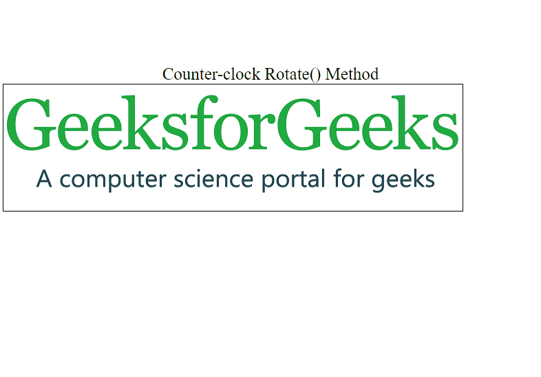
Counter-clockwise rotation
Sử dụng các giá trị âm để xoay phần tử ngược chiều kim đồng hồ.
Example: Ví dụ này mô tả phương thức rotate() ngược chiều kim đồng hồ trong CSS. Phương thức này xoay một phần tử bằng cách sử dụng các giá trị âm.
<!DOCTYPE html>
<html>

<head>
    <title>2D Transform</title>
    <style>
    img {
        border: 1px solid black;
    }

    img:hover {
        /* IE 9 */
        -ms-transform: rotate(-20deg);

        /* Safari */
        -webkit-transform: rotate(-20deg);

        /* Standard syntax */
        transform: rotate(-20deg);
    }

    .geeks {
        font-size: 25px;
        text-align: center;
        margin-top: 100px;
    }
    </style>
</head>

<body>
    <div class="geeks">Counter-clock Rotate() Method</div>
        <img src=
"https://media.geeksforgeeks.org/wp-content/uploads/geeksforgeeks-9.png"
             alt="GFG" />
</body>

</html>
Output:
scale() Method
Phương thức này dùng để tăng hoặc giảm kích thước của một phần tử. Việc tăng giảm phụ thuộc vào tham số chiều rộng và chiều cao.
Example: Ví dụ này mô tả phương thức scale() trong CSS. Nó dùng để thay đổi kích thước phần tử theo chiều rộng & chiều cao.
<!DOCTYPE html>
<html>

<head>
    <title>2D Transform</title>
    <style>
    img {
        border: 1px solid black;
    }

    img:hover {
        /* IE 9 */
        -ms-transform: scale(1, 2);
        /* Safari */
        -webkit-transform: scale(1, 1);
        /* Standard syntax */
        transform: scale(1, 2);
    }

    .geeks {
        font-size: 25px;
        text-align: center;
        margin-top: 100px;
    }
    </style>
</head>

<body>
    <div class="geeks">Scale() Method</div>
        <img src=
"https://media.geeksforgeeks.org/wp-content/uploads/geeksforgeeks-9.png"
             alt="GFG" />
</body>

</html>
Output:
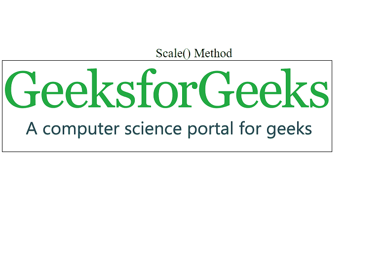
Note: Kích thước của các phần tử có thể giảm đi. Bằng cách sử dụng một nửa chiều rộng và chiều cao của chúng.
skewX() Method:
Phương thức này được sử dụng để làm nghiêng một phần tử. Góc nghiêng được xác định dọc theo trục X.
Example: Ví dụ này mô tả phương thức skewX() trong CSS. Nó làm nghiêng phần tử theo trục X.
<!DOCTYPE html>
<html>

<head>
    <title>2D Transform</title>
    <style>
    img {
        border: 1px solid black;
    }

    img:hover {

        /* IE 9 */
        -ms-transform: skewX(20deg);

        /* Safari */
        -webkit-transform: skewX(20deg);

        /* Standard syntax */
        transform: skewX(20deg);
    }

    .geeks {
        font-size: 25px;
        text-align: center;
        margin-top: 100px;
    }
    </style>
</head>

<body>
    <div class="geeks">skewX() Method</div>
        <img src=
"https://media.geeksforgeeks.org/wp-content/uploads/geeksforgeeks-9.png"
             alt="GFG" />
</body>

</html>
Output:

skewY() Method
Phương thức này được sử dụng để làm nghiêng một phần tử theo góc đã cho. Góc nghiêng được xác định dọc theo trục Y.
Example: Ví dụ này mô tả phương thức skewY() trong CSS. Nó làm nghiêng phần tử theo trục Y.
<!DOCTYPE html>
<html>

<head>
    <title>2D Transform</title>
    <style>
    img {
        border: 1px solid black;
    }

    img:hover {

        /* IE 9 */
        -ms-transform: skewY(20deg);

        /* Safari */
        -webkit-transform: skewY(20deg);

        /* Standard syntax */
        transform: skewY(20deg);
    }

    .geeks {
        font-size: 25px;
        text-align: center;
        margin-top: 100px;
    }
    </style>
</head>

<body>
    <div class="geeks">skewY() Method</div>
        <img src=
"https://media.geeksforgeeks.org/wp-content/uploads/geeksforgeeks-9.png"
             alt="GFG" />
</body>

</html>
Output:

skew() Method
Phương thức này làm nghiêng một phần tử theo góc đã cho. Góc nghiêng được xác định dọc theo trục X và trục Y.
Example: Ví dụ này mô tả phương thức skew() trong CSS. Nó làm nghiêng phần tử theo góc cho trước trên trục X và Y.
<!DOCTYPE html>
<html>

<head>
    <title>2D Transform</title>
    <style>
    img {
        border: 1px solid black;
    }

    img:hover {

        /* IE 9 */
        -ms-transform: skew(20deg, 10deg);

        /* Safari */
        -webkit-transform: skew(20deg, 10deg);

        /* Standard syntax */
        transform: skew(20deg, 10deg);
    }

    .geeks {
        font-size: 25px;
        text-align: center;
        margin-top: 100px;
    }
    </style>
</head>

<body>
    <div class="geeks">skew() Method</div>
        <img src=
"https://media.geeksforgeeks.org/wp-content/uploads/geeksforgeeks-9.png"
             alt="GFG" />
</body>

</html>
Output:

matrix() Method
Phương thức này kết hợp tất cả các thuộc tính 2D transform thành một thuộc tính duy nhất. Thuộc tính matrix chấp nhận sáu tham số như matrix( scaleX(), skewY(), skewX(), scaleY(), translateX(), translateY() ).
Example: Ví dụ này mô tả phương thức matrix() trong CSS. Nó kết hợp tất cả các thuộc tính transform 2D thành một thuộc tính.
<!DOCTYPE html>
<html>

<head>
    <title>2D Transform</title>
    <style>
    img {
        border: 1px solid black;
    }

    img:hover {

        /* IE 9 */
        -ms-transform: matrix(1, -0.3, 0, 1, 0, 0);

        /* Safari */
        -webkit-transform: matrix(1, -0.3, 0, 1, 0, 0);

        /* Standard syntax */
        transform: matrix(1, -0.3, 0, 1, 0, 0);
    }

    .geeks {
        font-size: 25px;
        text-align: center;
        margin-top: 100px;
    }
    </style>
</head>

<body>
    <div class="geeks">matrix() Method</div>
        <img src=
"https://media.geeksforgeeks.org/wp-content/uploads/geeksforgeeks-9.png"
             alt="GFG" />
</body>

</html>
Output:

Supported Browsers:
- Google Chrome
- Microsoft Edge
- Firefox
- Opera
- Safari
Note: Internet Explorer không hỗ trợ các giá trị global initial và unset.